3% Treasury Yields Still Don't Matter

- In February I argued the rate move was overdone.
- At the time many assumed rates were breaking out.
- How price and sentiment help determine future price action.
In February I wrote an article titled '3% doesn't matter'. This was about two weeks after the market hit its peak with respect to the overall rising rate fear.
There were 3 primary takeaways from my initial article.
- Rising rate concerns had hit a fever pitch
- 'Bad' charts were being passed around everywhere, artificially adding fuel to the fire
- The correct interpretation of yields showed a healthy rotation and/or normalization process
Today I will review the 2016-2018 cycle in yields, including price action, sentiment, and the impact to specific sectors. I will then take another look at where we stand overall on the 10-year treasury yield today.
Price and Sentiment
I've been consistently quoting Gundlach's comments on the value of technical analysis from a few weeks
...3% Doesn't Matter

- Everyone is talking about 3% on Treasury yields as a line in the sand
- The most common long-term yield chart being passed around is flawed.
- A look at the correct Treasury yield channels.
Let's first look at how we got here...
Chart Malpractice
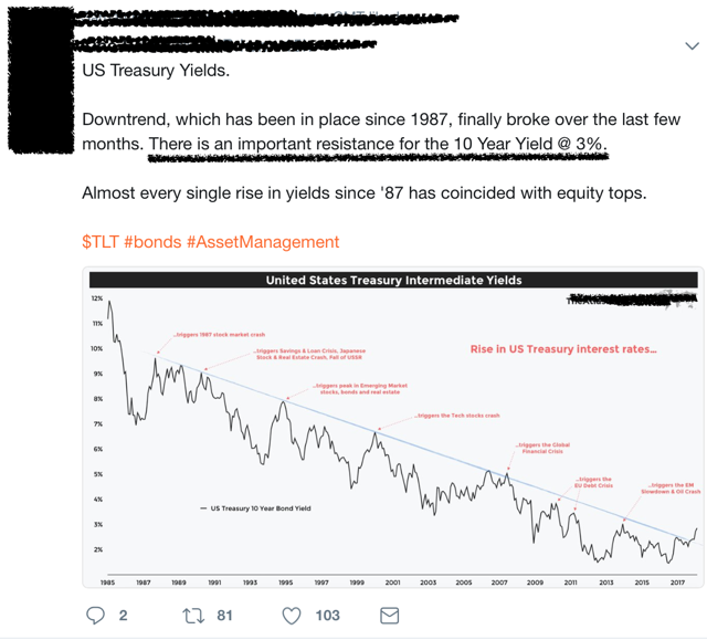
The most common chart being published on tens looks like the following 3 (please note they are not my charts; they are simply others I have come across in a variety of mediums). I have purposefully blurred out any contributor information as that isn't my game. This is about trying to be on the right side of the market, period.
Chart 1. The 3% resistance Level
This is the market's new bear 'hope'. 'Rising rates are about to break a 35-year downtrend and 'crash everything'. For that to happen however, the chart has to match th
...Macro Correlations

September 2017
- Macro correlations are an area of particular interest. The more important ones happen in currencies, interest rates, and commodities.
- A look at how long-term technical patterns can key us to macro shifts.
- An in-depth look at the yen's influence in this and past cycles.
- A look at a current scenario.
Macro correlations have been a particular interest of mine for a long time. This includes common concepts of intermarket analysis to some of the more unique relationships that can come and do often go.
Although many claim that today's managed atmosphere has rendered a lot of these relationships useless, I beg to differ. Markets move in trends, and when large trends change, asset class relationships will change as well, creating durable opportunities. Some are easily explained by economics, others simply are what they are, market phenomenona.
Some are likely happenstance and spurious at best, but by using longer-term technical anal
...

