3% Doesn't Matter
Feb 24, 2018

Arun S. Chopra CFA CMT
February 2018
- Everyone is talking about 3% on Treasury yields as a line in the sand
- The most common long-term yield chart being passed around is flawed.
- A look at the correct Treasury yield channels.
One of the most passed around charts in the last 2 months has been the ten year Treasury yield chart. Supposedly we are on the cusp of a major breakout in yields.
Let's first look at how we got here...
Chart Malpractice
The most common chart being published on tens looks like the following 3 (please note they are not my charts; they are simply others I have come across in a variety of mediums). I have purposefully blurred out any contributor information as that isn't my game. This is about trying to be on the right side of the market, period.
Chart 1. The 3% resistance Level
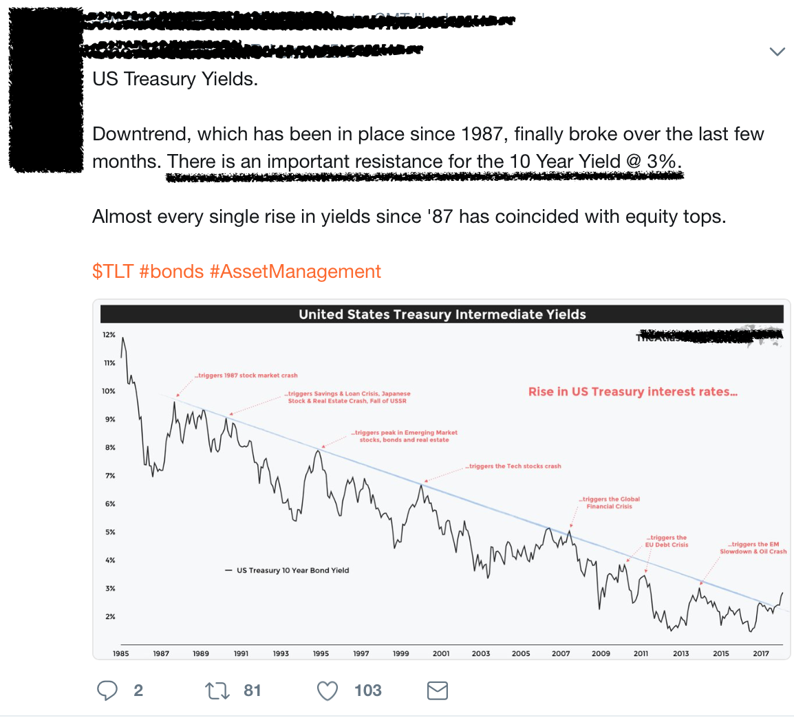
This is the market's new bear 'hope'. 'Rising rates are about to break a 35-year downtrend and 'crash everything'. For that to happen however, the chart has to match th
...