3% Treasury Yields Still Don't Matter

- In February I argued the rate move was overdone.
- At the time many assumed rates were breaking out.
- How price and sentiment help determine future price action.
In February I wrote an article titled '3% doesn't matter'. This was about two weeks after the market hit its peak with respect to the overall rising rate fear.
There were 3 primary takeaways from my initial article.
- Rising rate concerns had hit a fever pitch
- 'Bad' charts were being passed around everywhere, artificially adding fuel to the fire
- The correct interpretation of yields showed a healthy rotation and/or normalization process
Today I will review the 2016-2018 cycle in yields, including price action, sentiment, and the impact to specific sectors. I will then take another look at where we stand overall on the 10-year treasury yield today.
Price and Sentiment
I've been consistently quoting Gundlach's comments on the value of technical analysis from a few weeks ago, more specifically price levels and sentiment, and today is no different. To review, here are his comments. I will apply some of this going forward. The important takeaway is this is not just an exercise in price or chart patterns.
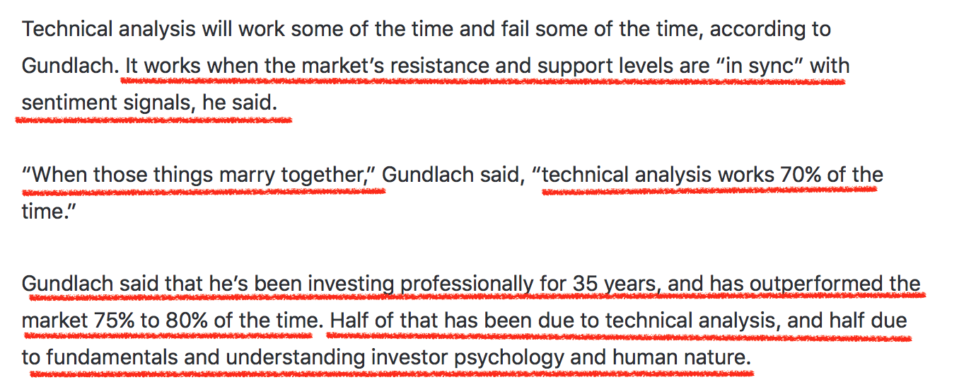
Although there are significantly more tools at our disposal with respect to both price action and behavioral finance, I fully agree that when price levels and sentiment are in synch, things tend to work well. This is primarily the approach I used to call the bottom in yields in the summer of 2016 (TLT Top) seen in the original article.
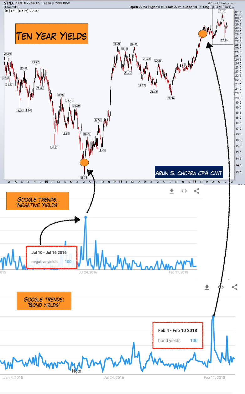
When Gundlach talks about sentiment the key is to understand extreme readings. I use numerous sentiment indicators, but a unique way to do this is through Google trends.
The chart below shows the bottom in yields in 2016. At the time consensus swung towards believing rates were going negative (primarily because they had done so in Europe at the time). This was part of the reason I got bullish yields and bearish bond prices (TLT).
The chart also shows the rate spike we saw from last summer till Q1 '18, where eventually consensus swung the other way and assumed rates were breaking out. This can be measured by Google trend searches for 'bond yields' (everyone began talking about it, suggesting sentiment was hitting extremes).
More Sentiment Indicators
In my macro work I also use 'proxies' to help identify what an asset 'might' do going forward. This can be applied to oil, gold, the dollar and a variety of vehicles once one understands the proper inter-market assets to chart against it.
Below is a model I built to help determine where rates are going. The black line tracks my model's yield 'expectations.' You can see the indicator bottomed before the low in 2016, and actually led the move higher in the middle of last year.
Today my yield proxy is off the charts. I've never seen such a high reading. A pure quant or someone seeing this for the first time may look at this and assume yields are going much higher.
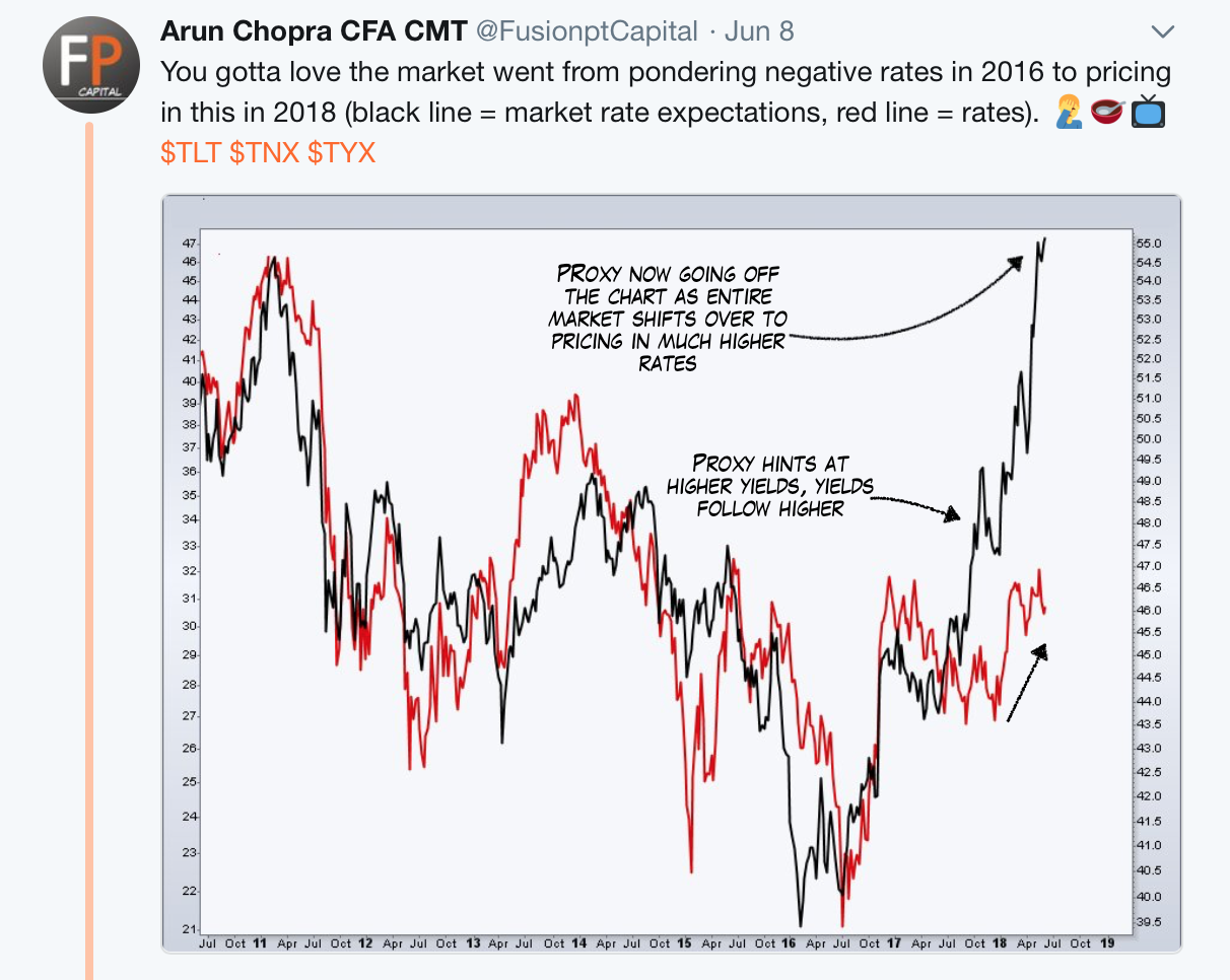
Since I created the index above, I know what is happening here. Sometimes proxies can lead the market (bullish), other times they can go extreme (bearish). Today, we are obviously seeing an extreme reading.
Moving further in on the curve, another sign of how extreme things have gotten is the extension in price on the 2-year yield. The RSI on the monthly chart of 2-year treasury hit an all-time of over 87 in Q2 '18. This is only the second time the RSI has hit the 80+ level.

Treasury Yield Breakout?
So why all the drama? Well, for one I go back to this media blitz we saw surrounding the move to 3%. Although obviously we have entered a different stage of the cycle (reflation, QT, hike cycle, deficits), market pricing at the margin is impacted by emotions.
Below shows the chart that was being passed around aggressively in Q1, suggesting that yields had broken out. In my view, this contributed to the excessive sentiment and expectations.
Say what you want about valuations, macro analysis, data trends, economic releases and so forth, when the markets start to move suddenly everyone becomes a technician. 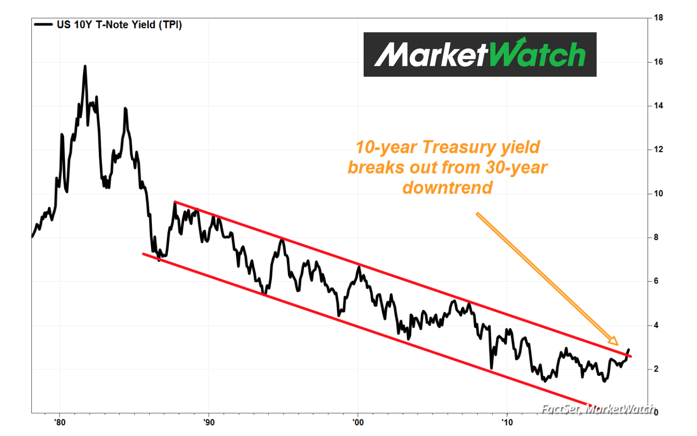
I have updated this version of the yield chart from February, which is now showing an even more extreme breakout than above. I continue to argue this is driving expectations and is still charted wrong. This is essentially chart malpractice.
 How Interest Rates Impact Sectors

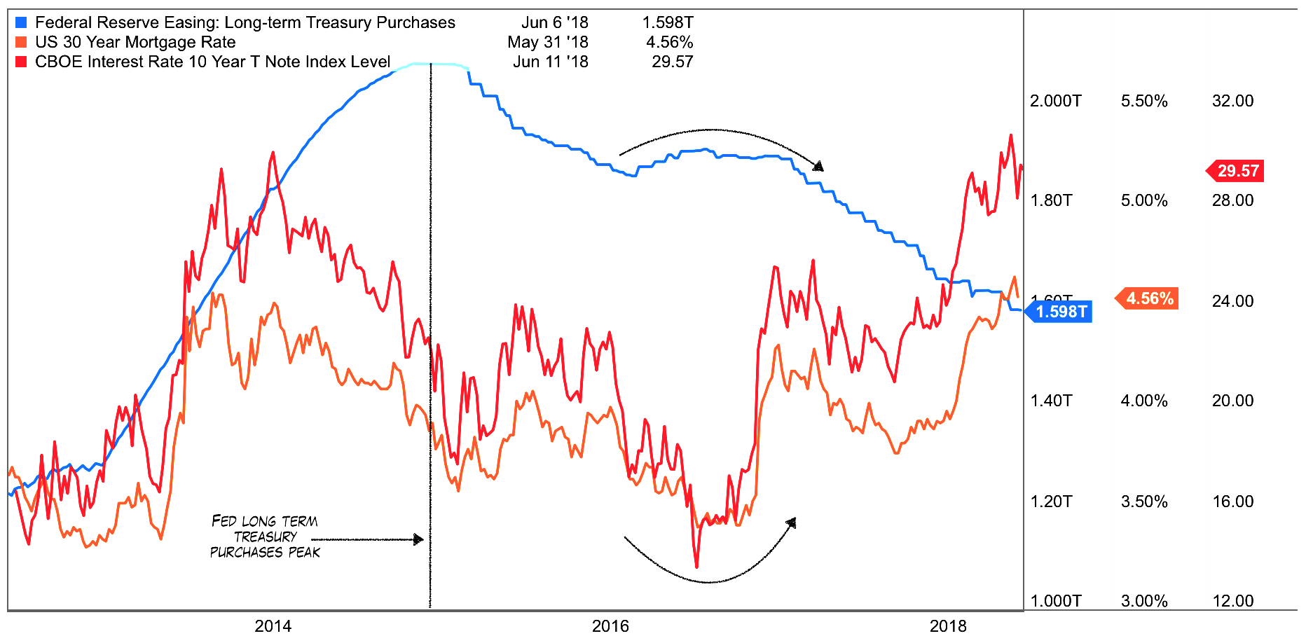
This is not to say the move in rates has been insignificant. If anything it has provided one of the most powerful rotations we have seen in the cycle. The following chart shows how yields in both treasuries and mortgages have backed up significantly, particularly as the Fed has dropped longer-term bond purchases by upwards of 25%.
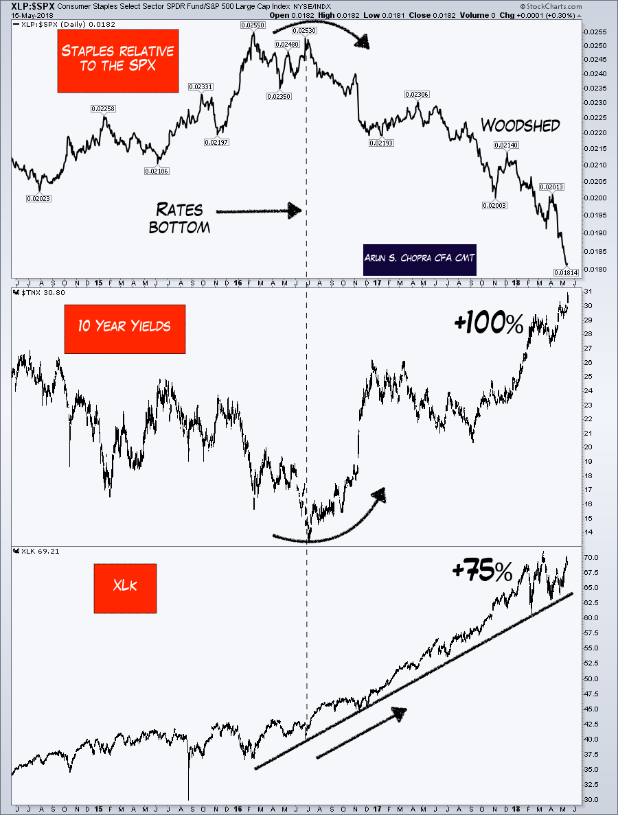
 The following chart shows equity market impacts, including Staples relative to the SPX, ten-year yields, and tech. You can see just how bad Staples has been hit on a relative basis to the market, while tech has cruised much higher.
I have found tremendous opportunity in the last two years from this rotation (and other sectors), and it is why Staples was my number one short idea since mid-2017 (while still calling for a melt-up and long stocks). The bottom line was recognizing the move from 1.4% to 3% on tens was a positive thing (normalization).
10 Year Treasury Yield Charts
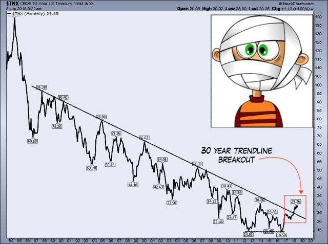
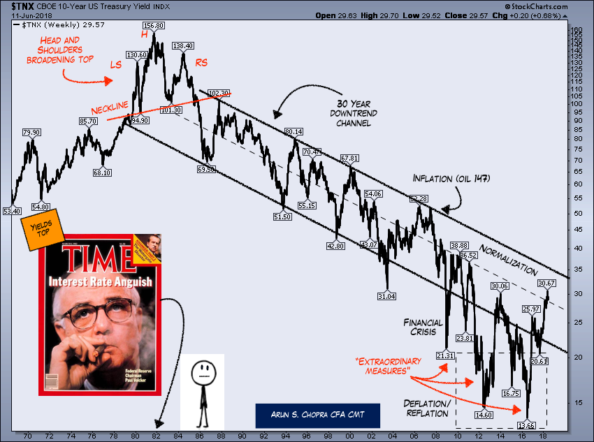
Three months later my same longer-term 10-year yield chart remains. For those who haven't seen it, this is the same 40+ year look at the 10-year yield as above, but charted properly.
Note my channels and the differences between here and the above. Detailed and contrarian orientated readers will note the magazine indicator striking again as well.
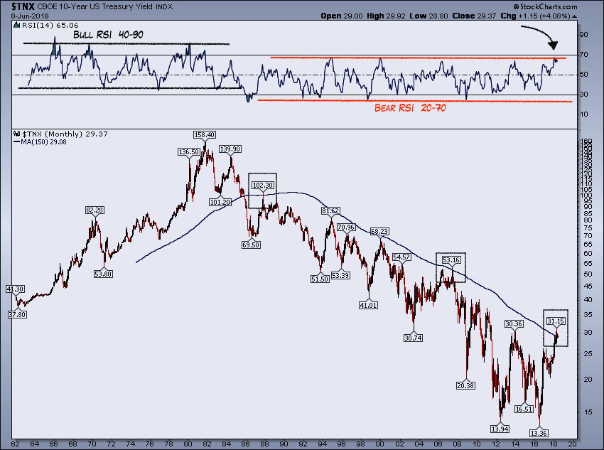
 A more updated (and technical) look at the 10-year with the RSI overlaid and the 150-month moving average shows resistance overhead. For those who have some experience with the RSI, one important thing is to note how it operates in different trends.
For bull trends we see ranges between 40 and 80, whereas in bear trends the RSI tends to range between 20 and 70. Although this yield move has been strong no doubt, it fits well within the parameters of the existing trend shown below. You can also see price has bumped right up against the 150-month MA, a level that has proven to be formidable in the past.
Conclusion
Sentiment analysis, price levels, and market proxies can help determine how 'full' a price move is, and when things are likely to reverse. I believe the rate move to 3%, although meaningful from an asset allocation standpoint, is not the game ender and/or even a trend breakout many have suggested.
In an era of QT and late cycle economics, our focus going forward will include not only price analysis, but sentiment, the entire curve, key levels, and of course impacts from shifting monetary and fiscal policy.
Thanks for reading.