Macro Correlations

September 2017
- Macro correlations are an area of particular interest. The more important ones happen in currencies, interest rates, and commodities.
- A look at how long-term technical patterns can key us to macro shifts.
- An in-depth look at the yen's influence in this and past cycles.
- A look at a current scenario.
Macro correlations have been a particular interest of mine for a long time. This includes common concepts of intermarket analysis to some of the more unique relationships that can come and do often go.
Although many claim that today's managed atmosphere has rendered a lot of these relationships useless, I beg to differ. Markets move in trends, and when large trends change, asset class relationships will change as well, creating durable opportunities. Some are easily explained by economics, others simply are what they are, market phenomenona.
Some are likely happenstance and spurious at best, but by using longer-term technical analysis, some creativity, and a deeper macroeconomic understanding, we can find hidden events. In this article, I will look at 2 past examples and then something I am keeping a close eye on going forward.
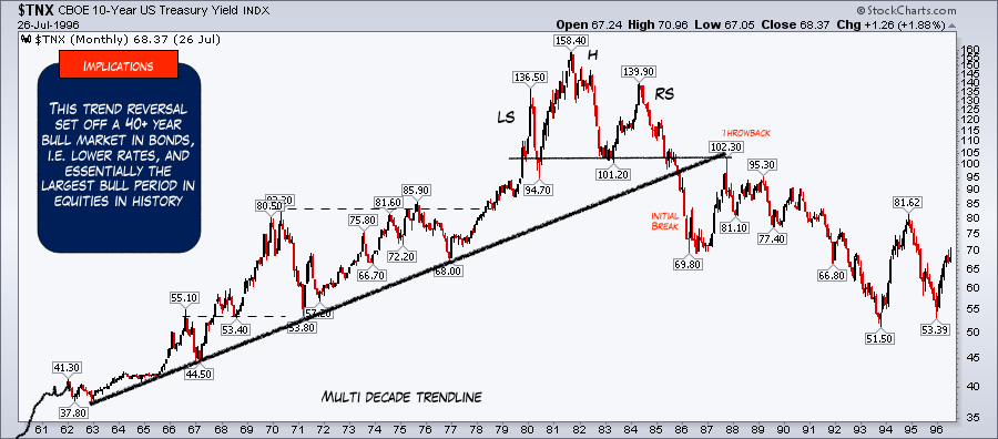
1. Treasury Yield Top, 1980
The Treasury Yield top in the early '80s set the stage for the major bull market in equities and the multiple expansion, as interest rates have declined for decades. This is nothing new.
However, here is the peak in rates back then on a price chart. See the technical pattern that developed. In this case, it was a clear head and shoulders top. The idea here is how to use these large broad patterns to time-related markets.
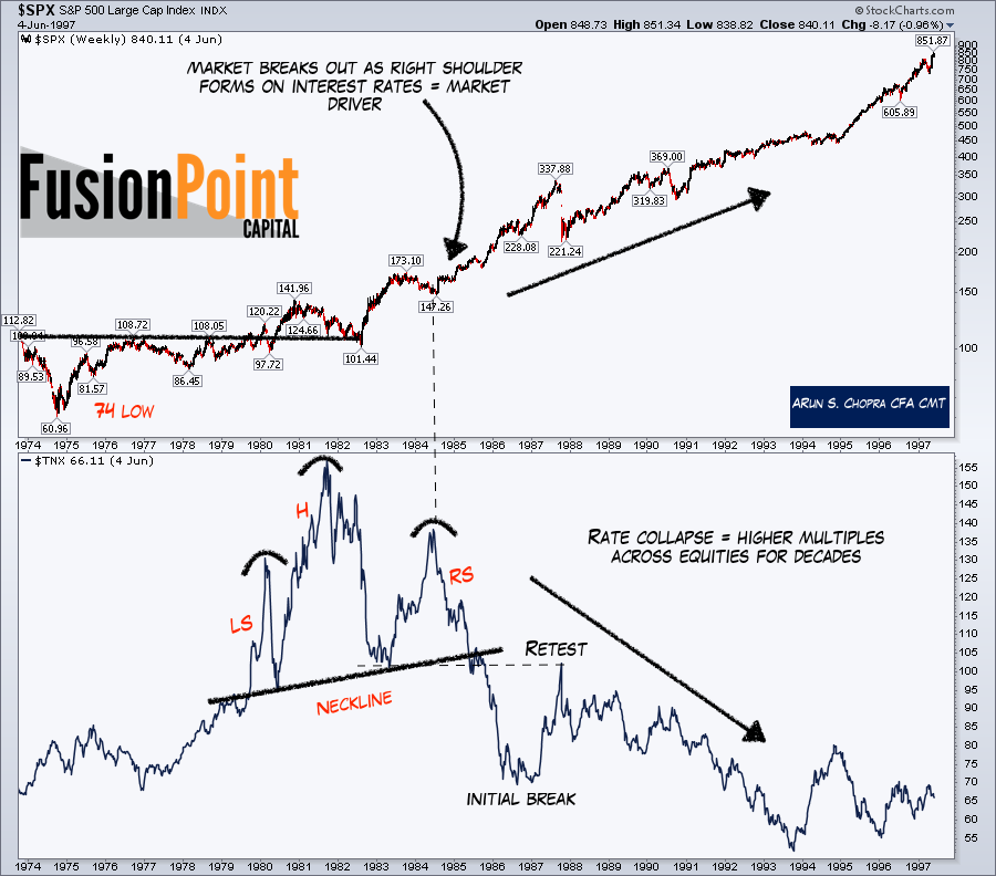
The following chart shows the 10-year yield, this time on the bottom panel with stocks above. You can clearly see the pattern better here and how the right shoulder, or final rally and fail, lines up well with the equity breakout.
Yes, the exact "breakout" had already occurred, however the sideways action between '83-'84 lined up well with the final countertrend rally in yields, and then the long-term trends certainly opened up from here.
Further, who at the time thought this would be a multi-decade move? Macro has tremendous power.
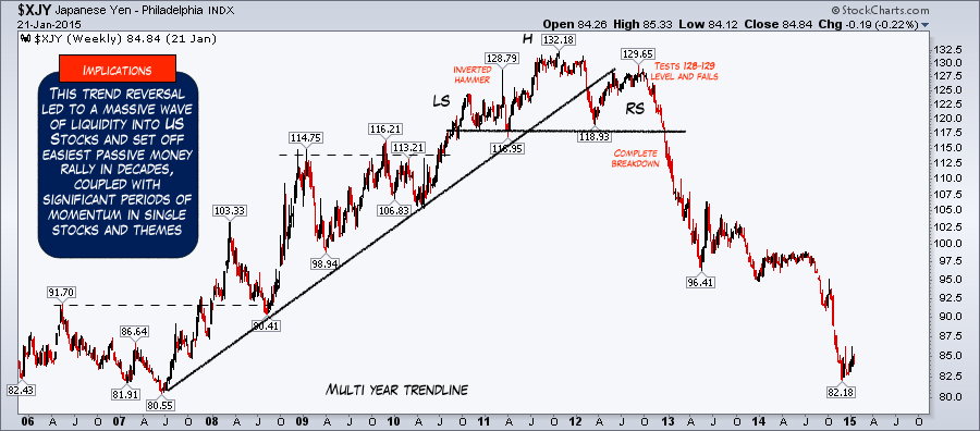
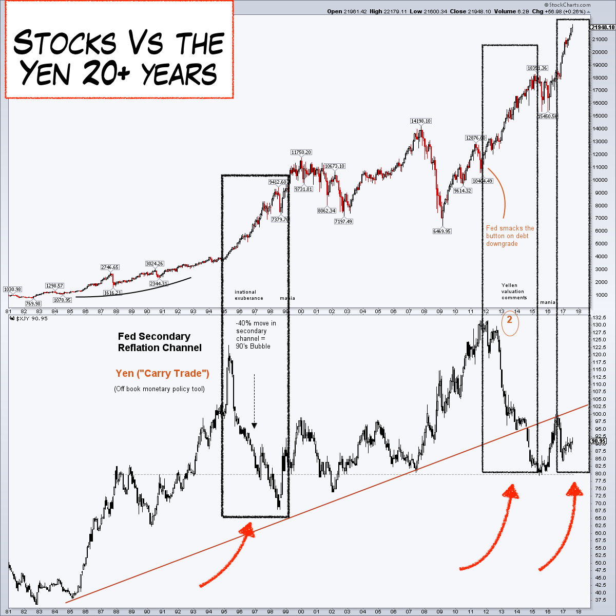
2. Yen Top 2012
The second example is my personal favorite, as I traded it in real time. I could never have foreseen the power the reversal in the yen would have, as I will show, but the opportunity was clear.
I knew we were going to see flows into US equities from the below, and that was a relatively decent edge; however, the power of the move was second only, I think, to the Treasury Yield top (bond bottom) in the '80s.
First, the yen top in the 2012 price chart. See the clear head and shoulders top, much like we saw in yields in the '80s.
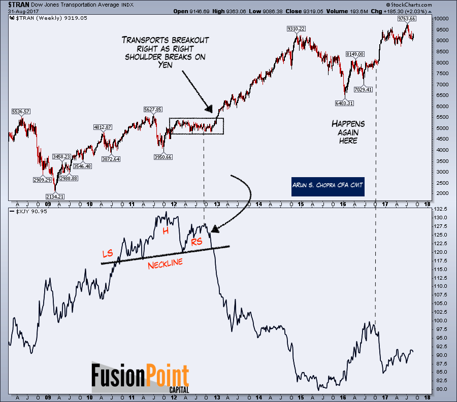
The following chart now shows the yen (the trade driver - much like interest rates in the '80s) on the bottom panel, again as a line chart, with the equity complex above it.
In this case, I have taken the Dow Transports, as that was one of the major beneficiaries, and the price literally waited and consolidated almost a year while the yen carved out a top.
Impact on Stocks
On the single stock level, these financial flows have impact too. One "theory" is as the yen devalues, foreign money rotates out of Japan looking for a home, and often that is US equities (insert carry trade here as well).
As that happens, that money is fairly price-insensitive, as it is fleeing the frying pan essentially for anything. In my view, that is how we get additional stimulus and liquidity into the system (beyond traditional monetary policy), and at these stages, valuations go further than most imagine.
Valuations
I have commented about valuation ranges quite a bit, but here is the chart again. Valuations are volatile, and this is why fundamental textbooks become worthless in cycle analysis. Liquidity, global monetary policy, currency, interest rates, etc. all create distortions that completely supersede more narrow bottom-up views.

Disney 2012-2017
But let's look at this process more in depth. Under the logic of investment flows coming into the US (either through safe haven investing and/or carry trades, etc.), one place we can expect that money to end up is in brand name US stocks. Here I've chosen Disney (NYSE:DIS) to make the example.
The chart below shows the price-to-sales multiple for Disney as the yen topped. You can see from the rally from 2Xs to 4Xs sales, we saw the yen collapse.
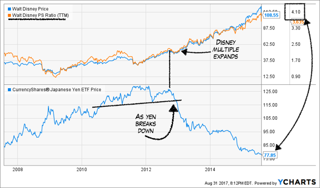
In fact, a closer look at the multiple shows the highest all-time reading for Disney's price-to-sales was right at the low in the yen. Disney traded at over 4X sales at the peak this cycle, higher than any other time in the company's history.

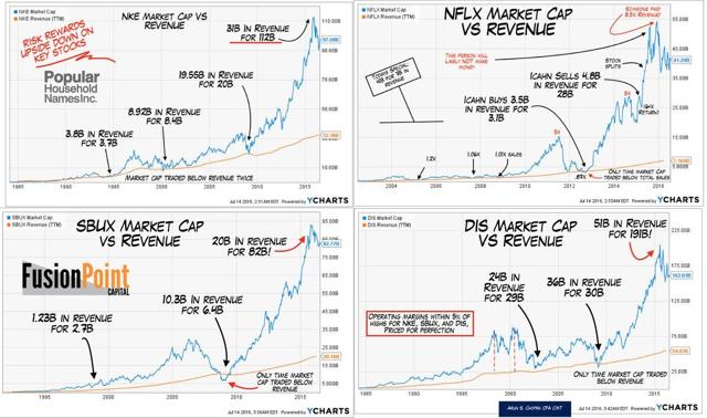
And it's not confined to Disney, as we all know. Here are 4 household names for a chart I made a year ago. Importantly, only one, Netflix (NASDAQ:NFLX) has made a new price and valuation high. The rest, the chart remains the top, which for the most part coincided with the yen low. This, to me, is what happens when price-insensitive money comes into markets via currency devaluations abroad.
Historical
However, we've seen this story before, so it's not a one-off. And although we can debate the merits of the below, my view is markets are not exact, nor quantitative to the letter.
These are periods of time we see creative intermarket take hold. If you test it repeatedly, you will likely find periods where the same relationships are not useful. But the '95-'99 massive bull move in stocks, post Greenspan's "irrational exuberance" moment, was accompanied but the same aggressive yen devaluation. The only time we've seen such rapid moves in the currency is in this cycle.
3. Staples and Interest Rates
So finally to the overarching point, one of the areas related to intermarket I've been most interested in is the staples sector. Hussman put together a fantastic chart a while back showing the valuation concerns when digging deeper into market sectors and subcomponents. It's the breadth of the valuations that is concerning (see below).
If we look closely, these historical valuations for the lower decile of the market likely have many of the staples hidden in them. Meaning that they are well above both market peak valuations of the past, even if, broadly speaking, some stocks like tech are not.
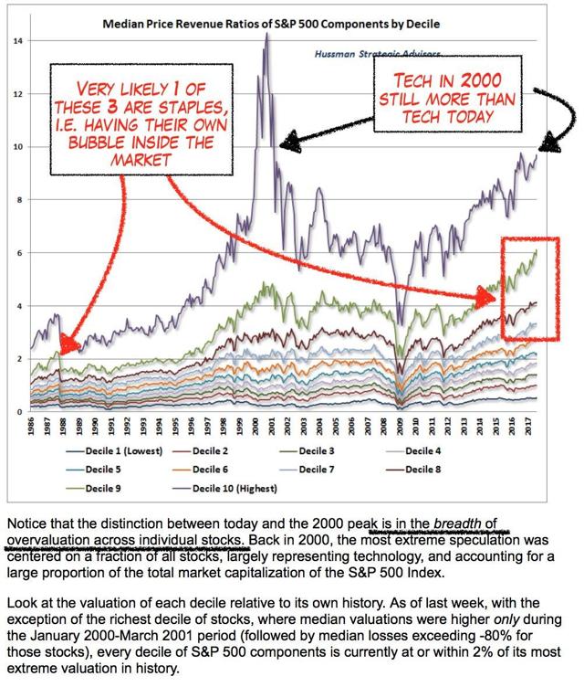
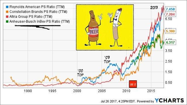
For more color on the above, take a look at beer and cigarettes on a price-to-sales basis. Pretty out there. I'd argue consolidation and operating margins are underpinning these, but so is yield chasing and investors who are looking for bond equivalent vehicles, when equity big picture is anything but. We've just never seen anything like this before in this space.
So when we look at staples and how they've fared against rates, it's obviously like most of the market, however, the sensitivity is naturally higher here. The bond-like quality of these issues is one of the biggest fallacies out there, in my view.

Obviously, the market strongly believes that rates will never rise again, and therefore, these are where they should be. I disagree, as hopefully I've shown markets don't stay in one trend forever, and macro shifts are some of the most dynamic opportunities. Further, I doubt it would take much to knock these off their current trend.
Long-Term Rates
Finally, the chart below shows the long-term look at interest rates. It makes little sense to give my view on how or when I expect these to turn - everyone has their own view on rates. I would simply point to the off-trend nature of the market after a 40-year downtrend, and that I plan to use the patterns here to look for additional macro opportunities. If these opportunities do develop, I imagine the trends would be more durable than many believe, and have staying power, as the market is fully conditioned towards the lower for longer theory, particularly on the long end.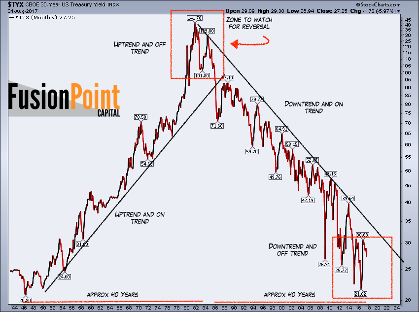
Thanks for reading....