The Twitter Turn

Arun S. Chopra CFA CMT
May 2018
- After falling 80%, Twitter has more than doubled off the lows.
- What can we learn about this entire cycle, from IPO to today.
- Bringing fundamental, technical, and behavioral factors together.
After being crushed since going public, Twitter (TWTR) has more than doubled off the lows. I wanted to spend some time looking at the entire cycle as there is much to learn from it in my view of it. Today, I plan to touch on valuation, charts, management, and a little behavioral.
Today's agenda:
- TWTR, GPRO, SHAK, OTCPK:HMNY, and the dreaded Doji (Technical)
- Financial Gravity (Fundamental/Behavioral)
- Stock compensation issues (Management)
- The Twitter Turn, bringing it all together
For those who know my work, I've often written about IPOs, pump and dumps, overvaluation, absurd reason, and bubble logic. So that's where I'd naturally like to start.
TWTR IPO
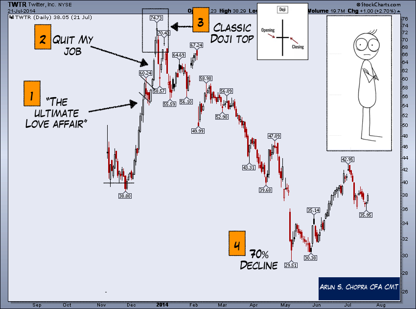
When Twitter came public in 2014, I was skeptical to say the least. Here we go again I thought. 25B? For what? A message board? Are we really doing this again? At the time, I hadn't used the 'barely' profitable platform, but I knew anything selling at a 20X its run rate was unlikely to work out well for investors.
Let's look at one of my favorite videos from back then, Crammer during the first month IPO pump.
Well, sure enough, the stock spiked, but unfortunately, it spiked right into a classic doji top and collapse. Dojis signify indecision and can warn of reversals at extremes.
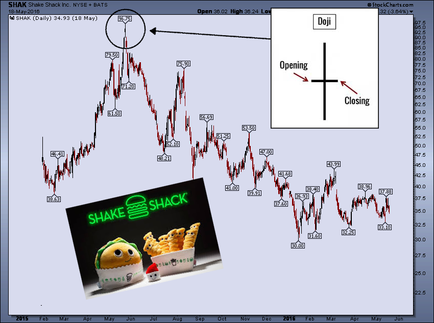
This pump and dump market structure post an IPO is nothing super new, we've seen this in numerous stocks. Below is the GPRO IPO, something I publicly shorted at in the upper 80s (post the doji peak).

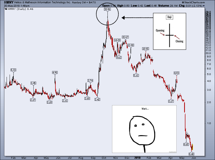
And the all-time killer, the HMNY doji. Pretty much a total and utter beat down. Worst I've ever seen.
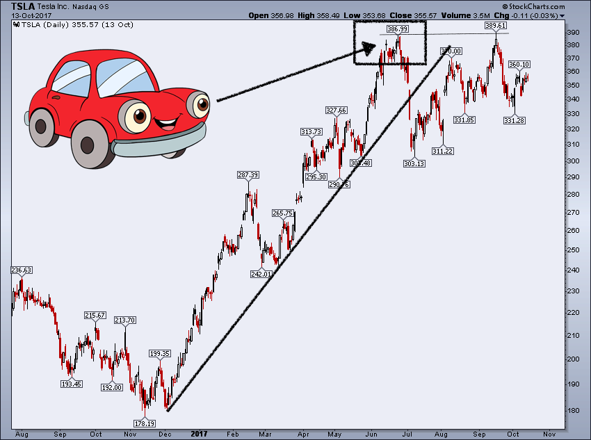
There's even a little-hidden doji on our good old pal Tesla's (TSLA) price chart right under the all-time high. We actually shorted this in the members' area in real time on the retest at 386.
Financial Gravity-Lose Lose Stocks
But let's get back to the fundamentals in 2014 and 2015. GoPro and Twitter were great examples of what I like to call lose-lose stocks. That is, they were priced so high that if the companies performed bad, the stock would have gone down (and dramatically), but even if the companies performed well, the stock would still likely have dropped (potentially substantially). This is basically the opposite of everything you want in an investment.
The efficient market hypothesis to some extent claims we cannot find these types of opportunities (and/or rationalizes the elevated prices), but availability and recency biases are common behavioral heuristics that can cause massive mispricings, especially in these types of stocks. Investors use shortcuts, invest in what they know (product wise), chase what is going up, or believe a good product/company means the stock must be good too.
There are numerous logical factors beyond valuation and momentum as to why we see such pricing. Although outside of the scope of today, the marginal stock buyer at this stage of a bull market is operating under an entirely different framework than financial statement ratios and DCFs.
This is a chart from November 2015 showing this lose-lose dynamic on GoPro and Twitter. Note how far both stocks had already fallen up to this point. I call this level of overvaluation a sort of financial market gravity.

Unsurprisingly, even as far as the stocks above had already fallen (GRPO down 90 to 25, Twitter 73 to 25), they still collapsed another 40-90%. That is because as the below shows the multiples contracted significantly (gravity). Tesla recently has come under this same multiple contraction pressure as well as investor preferences have flowed to Ferrari (RACE) and other auto manufacturers (CARZ).
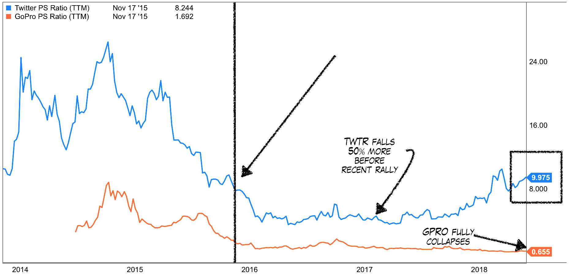
Meanwhile, if we look at 2015 revenue growth, both companies had strong growth but again, they were perfect lose-lose names. Twitter revenues were up nearly 200%, but the stock got cut in half. GoPro even worse in terms of declines.
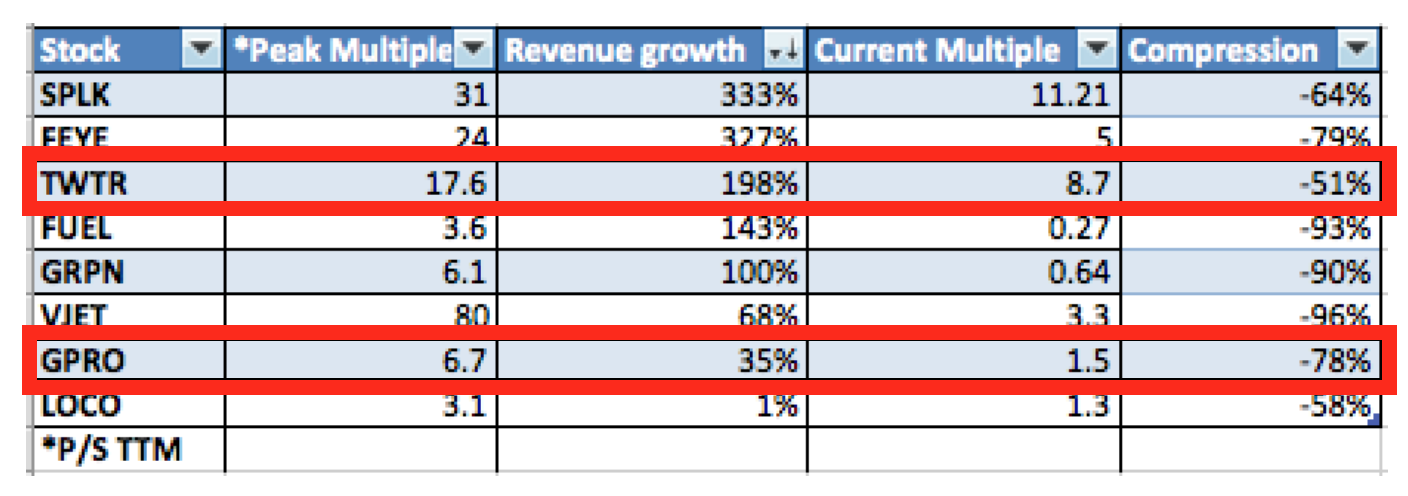
2015 Multiples, Revenue Growth, and Compression
Stock Compensation
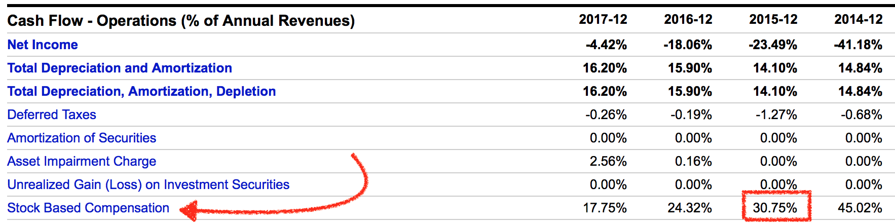
I was also highly critical of Twitter's overall stock compensation, at one point, one of the highest as a percent of revenues I have seen (averaging approximately 30% in 2015).
The following chart shows this dilution as a percent of revenue. Bottom line is there is just no way for this to work for a shareholder unless the valuation is insanely low or the company has some sort of monopoly. The deck is stacked against you.
Again, for those who have seen my stuff, I have a bundle of these stock comp charts as I find it to be one of the bigger games played on the retail investor. My Fusion strategy stocks run far away from this type of dynamic below.
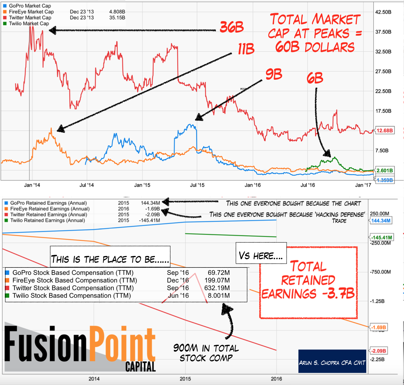
Between GoPro, Fire Eye (FEYE), Twitter, and Twilio (TWLO), there was a total of 1B in stock comp vs. a -3.9B in retained earnings in a 12-month time frame. That doesn't even scratch the surface of the equity losses to anyone holding these names.
Twitter Turns: Stock Doubles
But trends don't last forever, and some companies can recover from this gravitational pull creating pretty incredible opportunity. Twitter did just that.
In 'Intel: The 15 Year Breakout', I discussed one of my new strategies focusing on earnings yields and price action. Another variation of this can use free cash flow as the yield, which in Twitter's case actually spiked to over 6% in early 2017. Both strategies aim to target similar fundamental factors (some form of yield) and technical indicator (price).
The chart below shows Twitter's share price vs. FCF yield. You can see how they effectively inversely correlate. This is a combo you want to see, weakening price with rising overall FCF yields. Effectively, this is what I did with Intel (INTC) prior to the 25% run.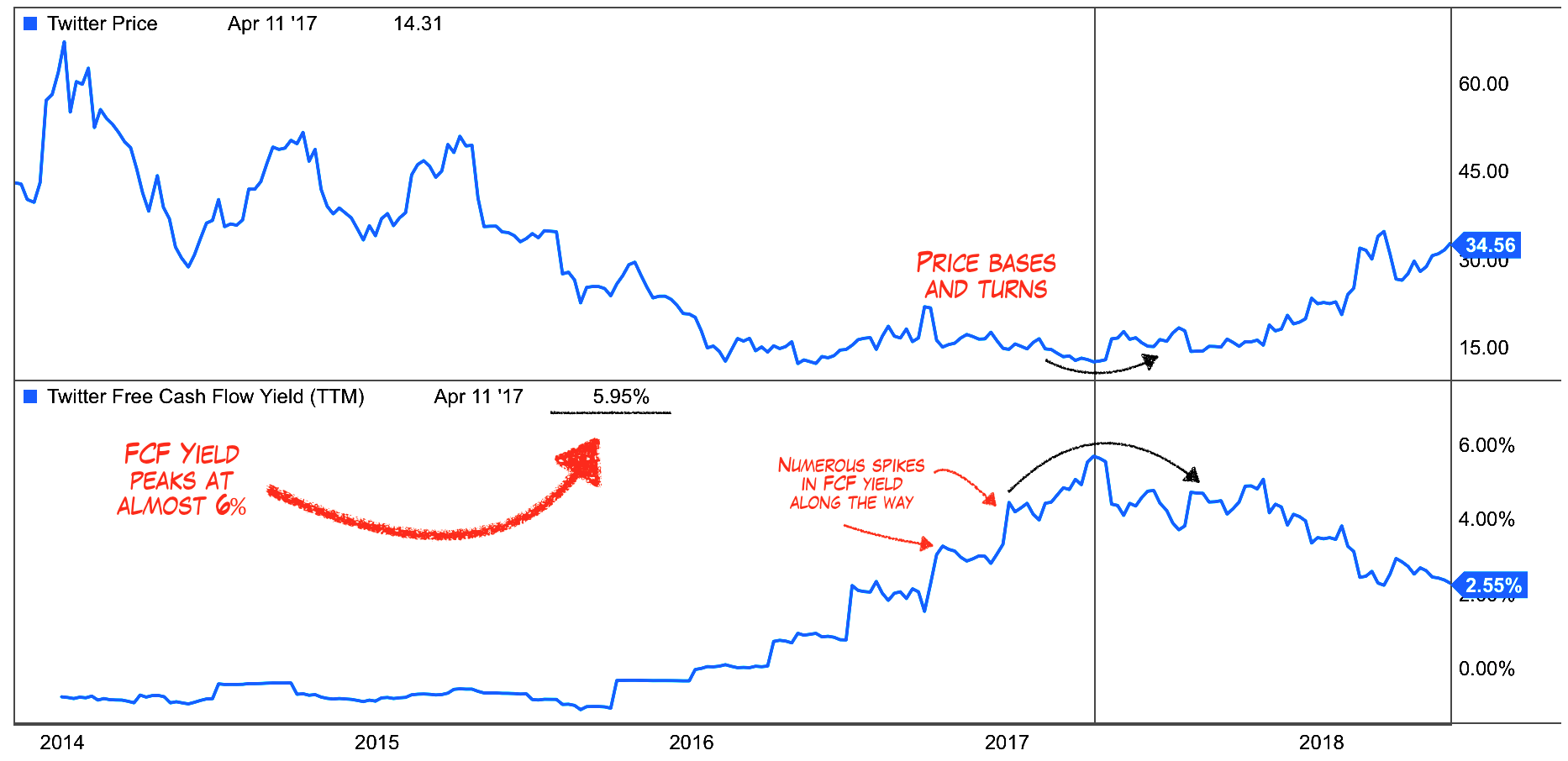
I continue to stress the importance of timing with respect to valuation. It's not too difficult to discern what any stock's FCF yield is at any given time. The question as always is when should you buy it? This becomes a function of risk premiums, growth rates, industry analysis, comparative valuations, additional assets, and investor payback periods (read risk appetite).
In other words, variability and subjectivity. In Twitter's case, if you had waited for say an 8% yield, you would have missed a 100% move. If you thought 4% was compensatory, you would have been stuck for a year. Not a big deal from a long-term investor standpoint, unless the company misses and premiums worsen. Double whammy.
The long-term chart on Twitter at the time is about as helpful as it's going to get in terms of suggesting the market was ready to support the stock at a 6% FCF yield. This is why I care about price action. I simply want market confirmation that what I see in the stock is confirmed by price. Note the 3rd test of the 14-dollar level is the actual peak in FCF yields at 6%.
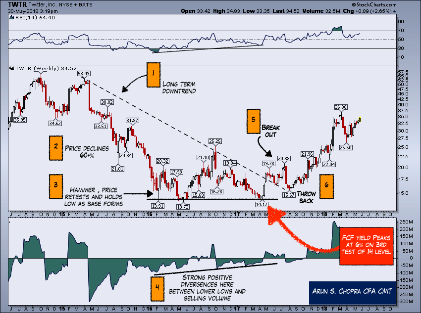
Finally, we are not confined to just fundamental and price factors. Another strong positive was stock compensation had been cut in half during the base. This speaks primarily to a management factor. I have management factors built into 2 of my 8 strategies, but the key to my work is bringing them together. Essentially, any one of these three components (good FCF yield, basing chart, lower stock comp) as a standalone is not enough to take action.

Today, I personally use Twitter more than ever, including a private twitter solution for members. I find the platform great, I can express views easily, every real news event now I tend to go there to see what is trending. I have met some pretty incredible people off it. It's been nice to see the stock really rumble here especially in such a durable way (fundamental valuation plus weekly technical base). I try to keep at least 2-3 of these types of base building, high yielding names in my portfolio at any given time. They add a nice longer-term tail to the returns once the mark up phase begins.
GPRO and SNAP
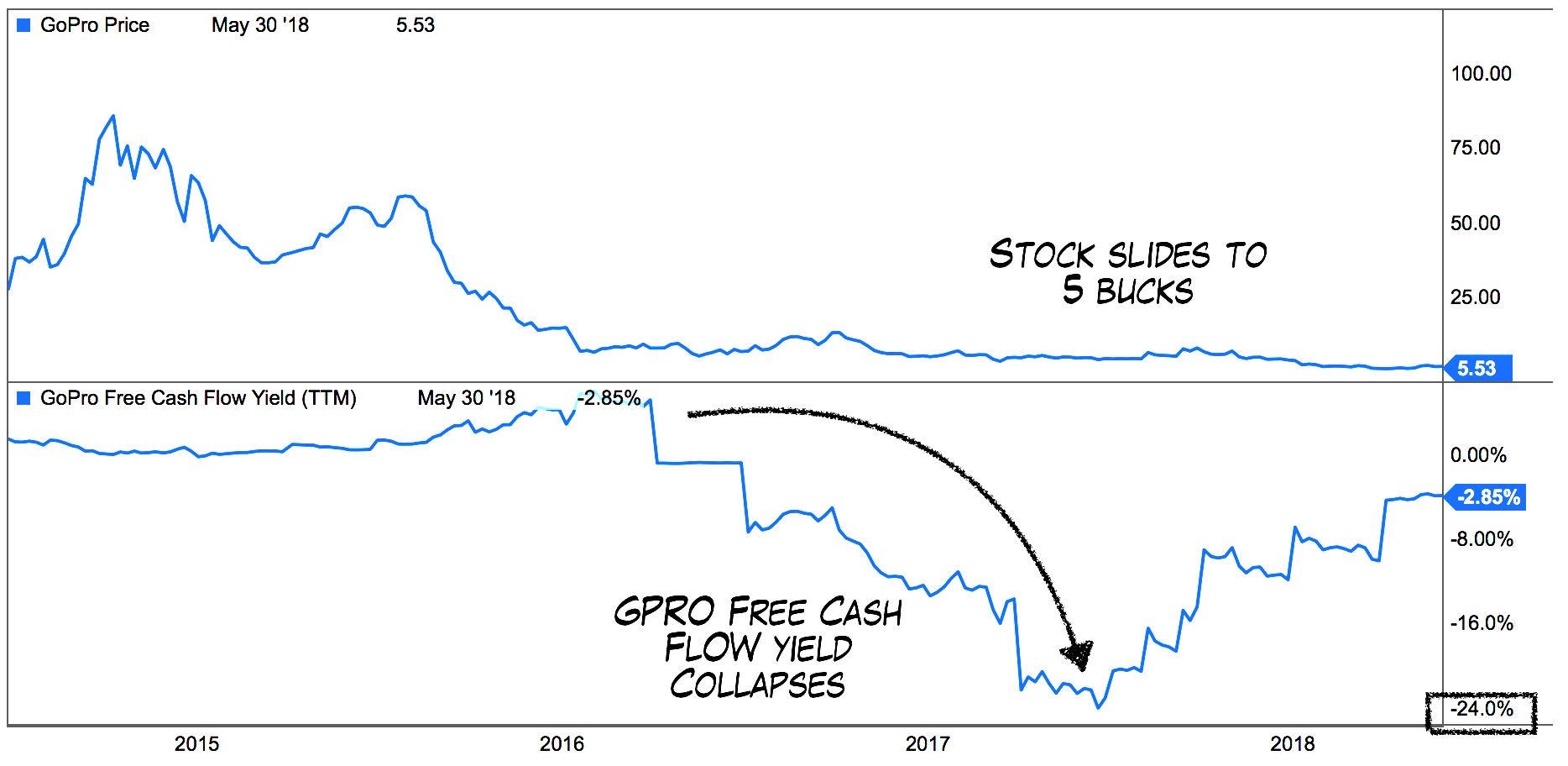
Before I get out of here, let's look at how this strategy overall worked with GPRO and SNAP. I saw many try to buy GPRO all the way down under the same heuristics discussed earlier (good camera, must be good company or going up so probably going higher etc.). When we run this model, we find GPRO worsened significantly and it's obvious why it's never recovered.
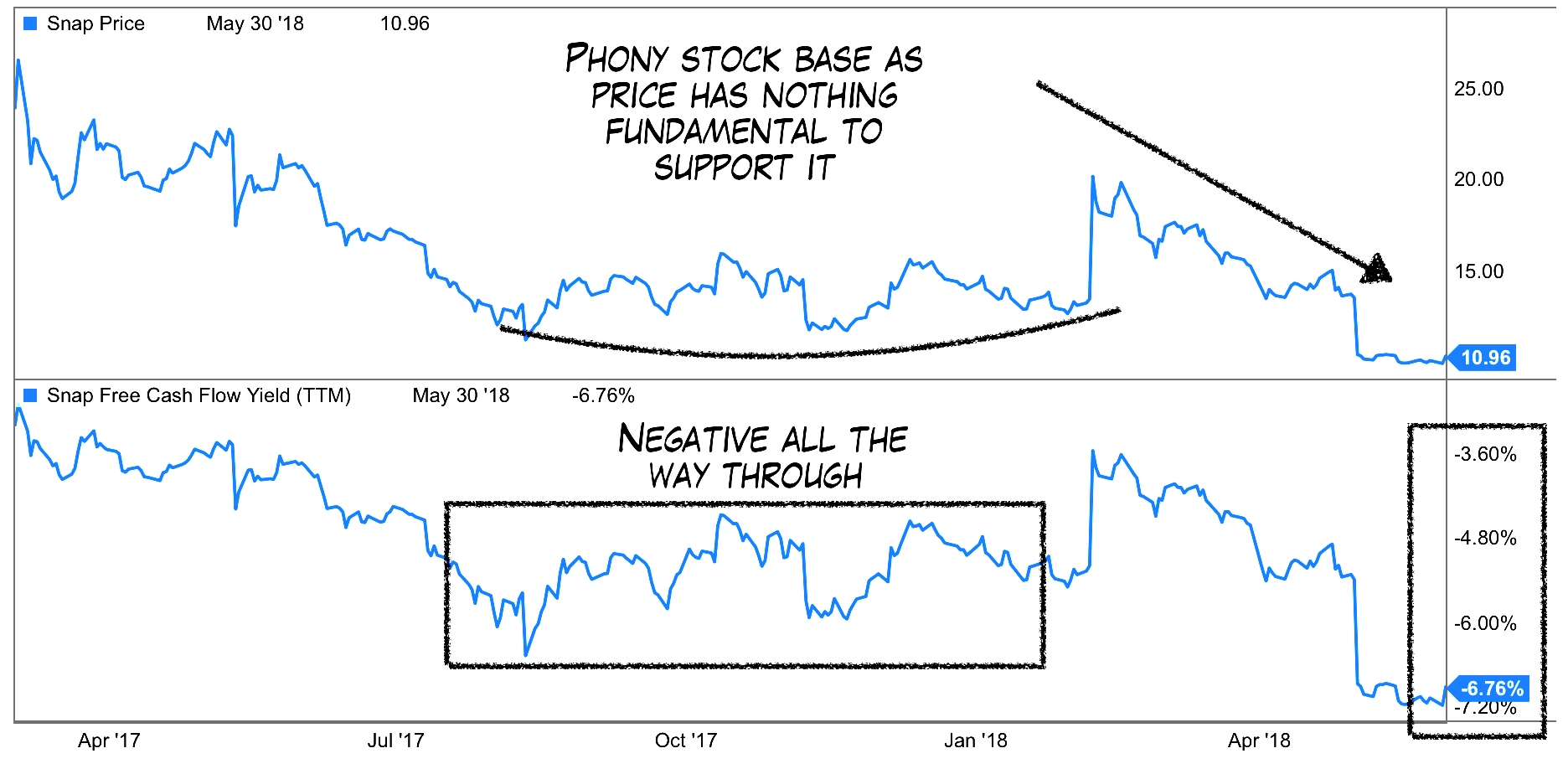
SNAP is a great example of how just a price chart can be totally useless on its own as well. Again, I am fundamentals first, so the following excites me all the same.
In the top panel, you can see a solid price base building, much like in Twitter. In fact, many got long that breakout thinking this was going to take off like Facebook (FB) and Twitter did. Instead, the free cash was negative at the time and eventually both collapsed. Pure technicians may call this a false breakout, but for me, it's a marginal and/or useless setup.
Conclusion
FCF yields are good starting point to gauge whether a name is worthy of investment. It is essentially 1 of 8 strategies I focus on. Free cash flow doesn't take into account dilution particularly through stock compensation, so deeper analysis towards management factors is often needed. Furthermore, FCF yields alone don't tell you when the market is comfortable with the name, or in other words when you should start buying.
Price charts can help determine better risk-adjusted entries as we add layers of safety through our entry price, time in the market, and general market wide confirmation.
Thanks for reading...