The Fed Pulls The Punchbowl

Arun S. Chopra CFA CMT
November 2018
- Markets come under pressure as the Fed pulls the punchbowl.
- A look at how to monitor liquidity across equity markets.
- Why and how I shorted NVIDIA and Netflix near their peaks.
A deeper dive into credit and dollar dynamics.
After calling for major breakout last year in "The Melt Up", I switched to a much more cautious stance as the calendar turned over. There were four major factors coming into the year I was most concerned about. I often see laundry lists of concerns; I have found that somewhere between pointless, redundant, and confusing. The following four however lined up perfectly and were powerfully simple (no particular order).
- Proprietary exhaustion indicator fired in Jan., first time since 2014
- Election Year Seasonality
- Fed Policy
- Trade War
It was these four reasons that I stayed balanced in 2018, with 65% equity exposure on average all year, with much of that long/short. As the year has progressed, the above framework has proven solid. Furthermore, much of my long equity was skewed far away from the crazy momo stuff, with a hyper focus on balance sheets, and cash as a portion of total assets.
Today, I want to focus on bullet points 1 and 3 (Proprietary Indicator, and Fed Policy). At the end of the day, it really doesn't matter which risk has most expressed itself (impossible to know), but these are two worth discussing at this point in the year.
Buying Pressure Exhaustion
The chart below shows the S&P 500 since 2010 on a weekly basis. I've added the 50-week and 200-week moving average. I've marked the three points my indicator has fired since the 2009 low. The key point here is these are extreme with limited readings. For primary indicators, it's important to have limited but meaningful readings. Something the below accomplishes.
Some important observations:
- Duration between trend and signal
- Duration between signal and ultimate low
- Volatility and risk events post signal
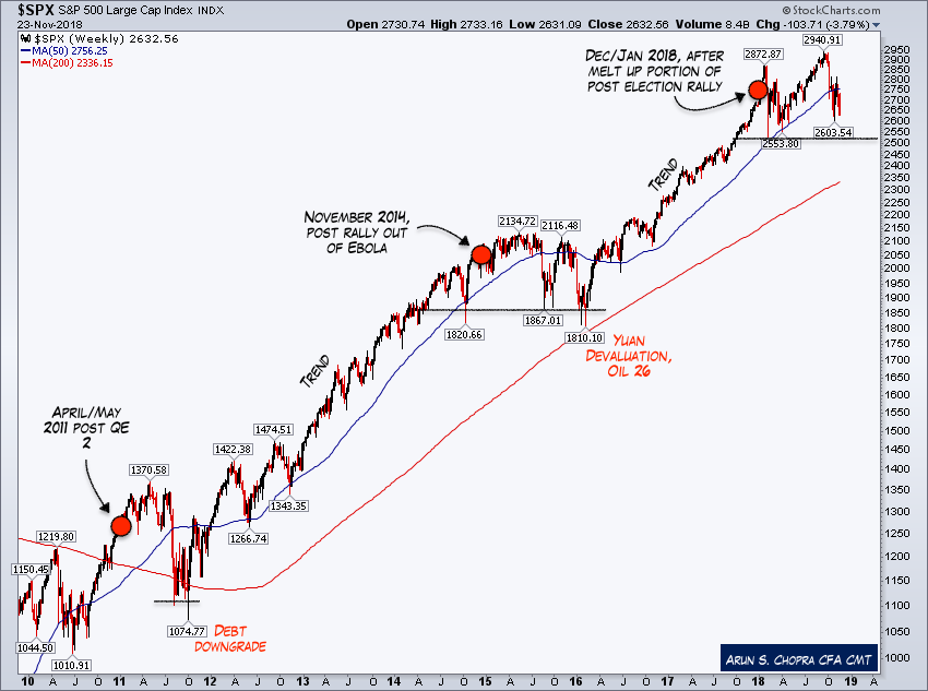
Markets however are not repetitive; they are dynamic. While some of the takeaways are useful, some are at best loose connections (for instance, expecting the exact same outcome as the prior signals).
To provide some background on how this signal targets extremes, I've provided a zoom-in of each market. Simply note the speed and acceleration into the signal. Ultimately all that mattered going into 2018 is we had an extreme condition in place.

Fed Policy and The Punchbowl
Moving on to Fed Policy, as the year has progressed, I have been focused more on the Fed than any of the other elements of my four concerns (yes, including the trade war, although it's debatable). Let's take a look at some of what we are starting to see. First, the actual punchbowl. The chart essentially speaks for itself.
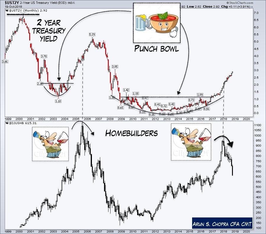
The following chart is meant to be a bit simplistic and a bit of a joke; however, there is a fair amount of truth here. Part of my working models on Fed policy includes the idea that as valuations rose, I expected to see more hawkish action.
We can debate all day whether this is a primary concern of the Fed, where/when it should have acted etc., but the bottom line is equity market price stability (defined by long-term valuations) is a Fed mandate whether people get it or not (and no, of course, it hasn't been good at managing it at all).

Fed Balance Sheet and Equity Market Liquidity
This cycle is obviously not like the last few, as the Fed has built up a massive +$4T balance sheet since the GFC (Global Financial Crisis). This changes the dynamic of monitoring liquidity. The chart below shows the rate of change in the last year of the effective Federal funds rate, total Fed assets, and the S&P 500. Year over year, we now have a 65% move in the front end, a -8% move in the balance sheet, and the market is sideways at best for the year.

A big point I've been making to my members is this dance between the front end and the balance sheet is critical this cycle. Although we can measure the front end in absolute terms, there is no previous model to think about the change in the balance sheet. The above is one way I am doing so.
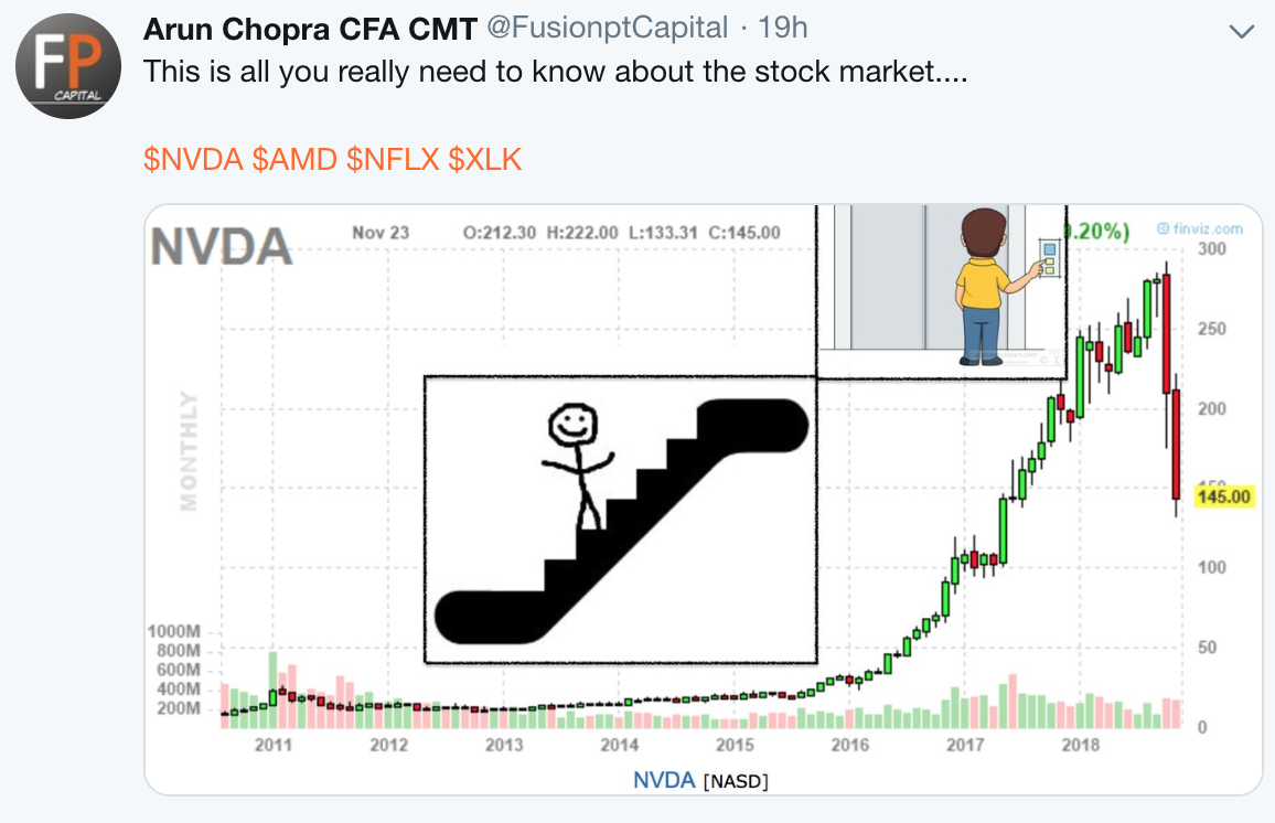
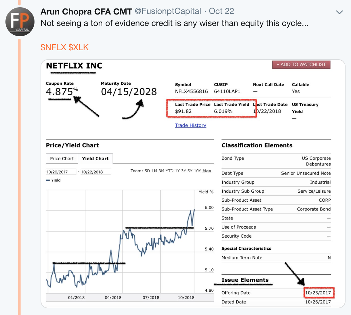
And although the market is effectively flat, there has been major damage particularly across the momentum names. Part of the reason I shorted NVIDIA (NVDA) and Netflix (NFLX) was based on this combination of declining liquidity and continued speculative market action.
The following chart shows this combinatory dynamic. The important point is the mix between declining liquidity and rising risk tolerance for momentum names (as evidenced by rising premiums). That created an absolutely killer combo.
NVIDIA and Netflix shorts
For my technical enthusiast readership, here are both my NVIDIA and Netflix shorts based off the charts. For those who are more dismissive of the charts, hopefully seeing the combo of valuations, liquidity changes, and price action helps you see the bigger picture. These price patterns worked specifically because everything was in place.
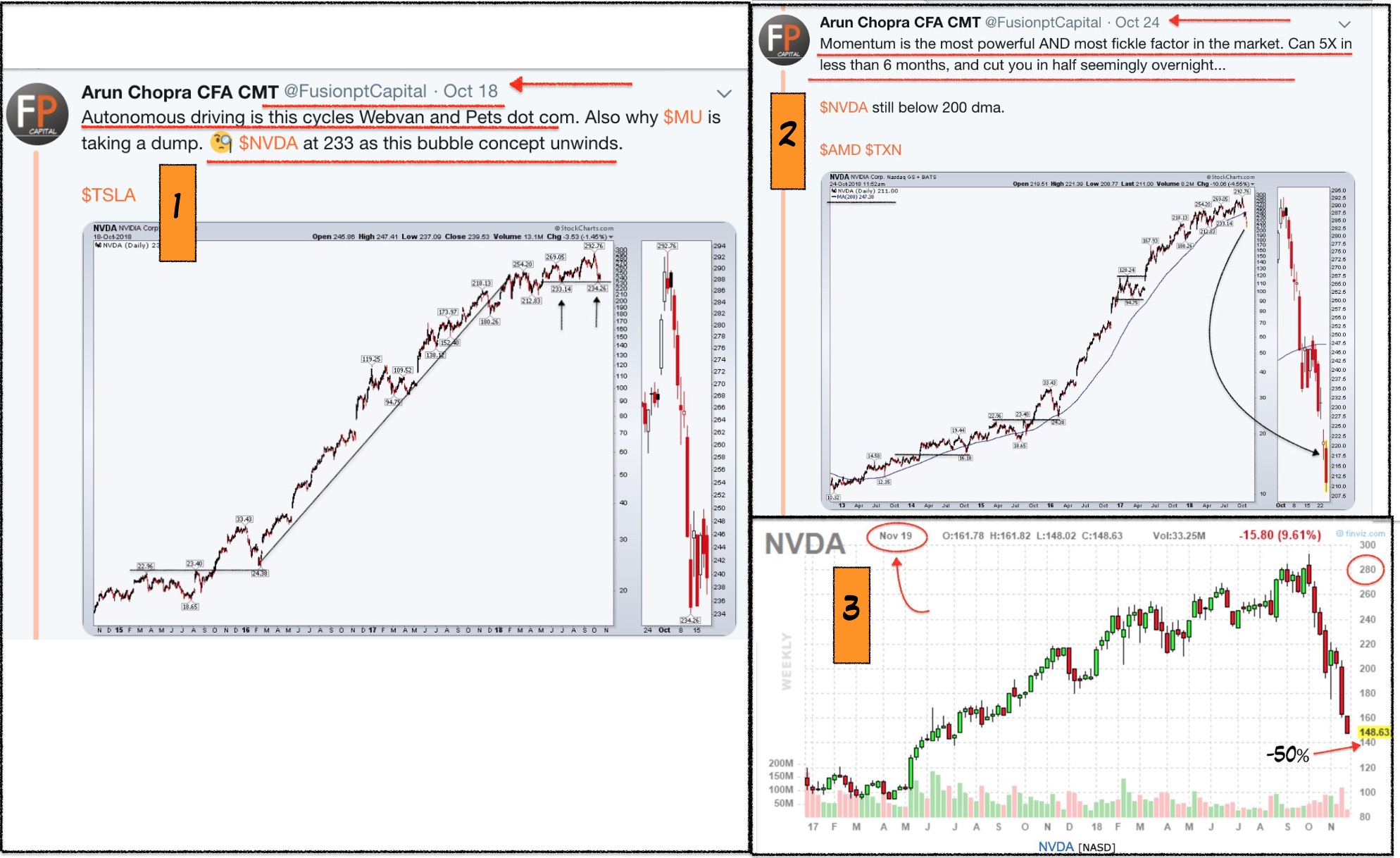
Note below NVIDIA dropped 50% in less than six weeks:
Netflix was equally thrilling. One important point on Netflix was the earnings in between the initial entry. Many thought this "beat" had some meaning, when really it was irrelevant. This is what multiple contraction looks like. Bulls had no chance. 
Further, you can also see how credit concerns particularly on Netflix had been hitting the debt stack (posted October 22nd). All of this is part of the Fed pulling the punchbowl.
Short-Term Rates and the ROC (Rate of Change)
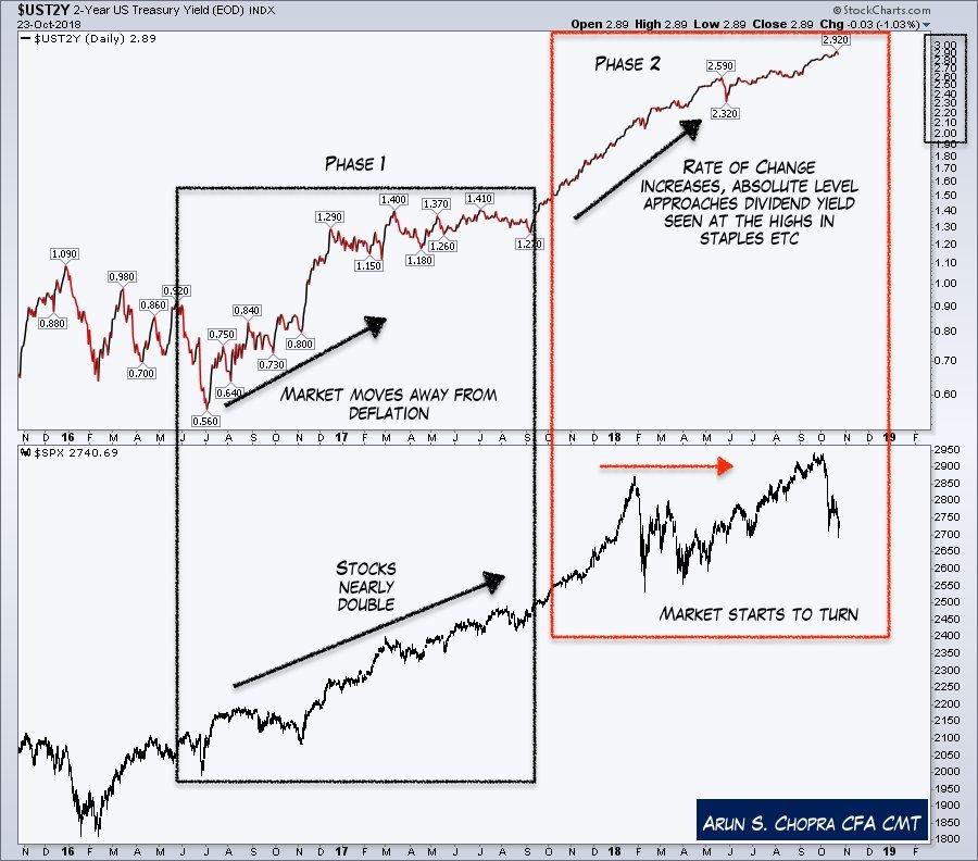
Getting back to rates and said punchbowl, both the absolute level and the rate of change on the front end over the last year have been important dynamics. The chart below shows "phase 1" of the rate rise. I consider this the "good" part of the cycle, where we saw market concerns over deflation ease and a near double in the indexes. For those who remember prior to this move, rates had hit a low of 1.38% on the 10-year, and there was significant discussion of negative rates across the globe.
"Phase 2" has been much more challenging as evidenced by the red box below. Note some of the remarks there that speak to both absolute levels and ROC (rate of change).
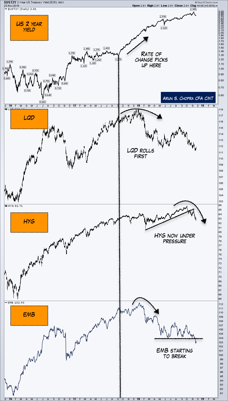
And we are now starting to see some of this spread across the risk curve and beyond LQD and into HYG and EMB. This is probably where my eyes are most focused in terms of credit, and I would be quite surprised if the Fed pushed on this much harder. It's very hard to see how equity could withstand real markdowns in HYG and EMB (even with these charts, spreads are historically low).
The US Dollar
And finally the US dollar. As a dollar bull for years now, I have watched countless traders and investors destroy their accounts through bitcoin and gold miners.
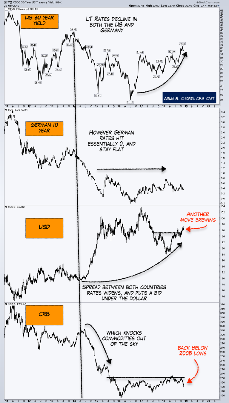
A simple concept I haven't seen discussed enough in the retail world is the rate differentials between the US and Germany. This has been a major floor for the US dollar. This then has filtered negatively into risk assets. The below chart walks through how this works. This is a multi-year weekly chart.
(The bottom panel shows the CRB, which is actually below the 2008 lows if you can believe it. Again, I'd be surprised to see the Fed push much harder).
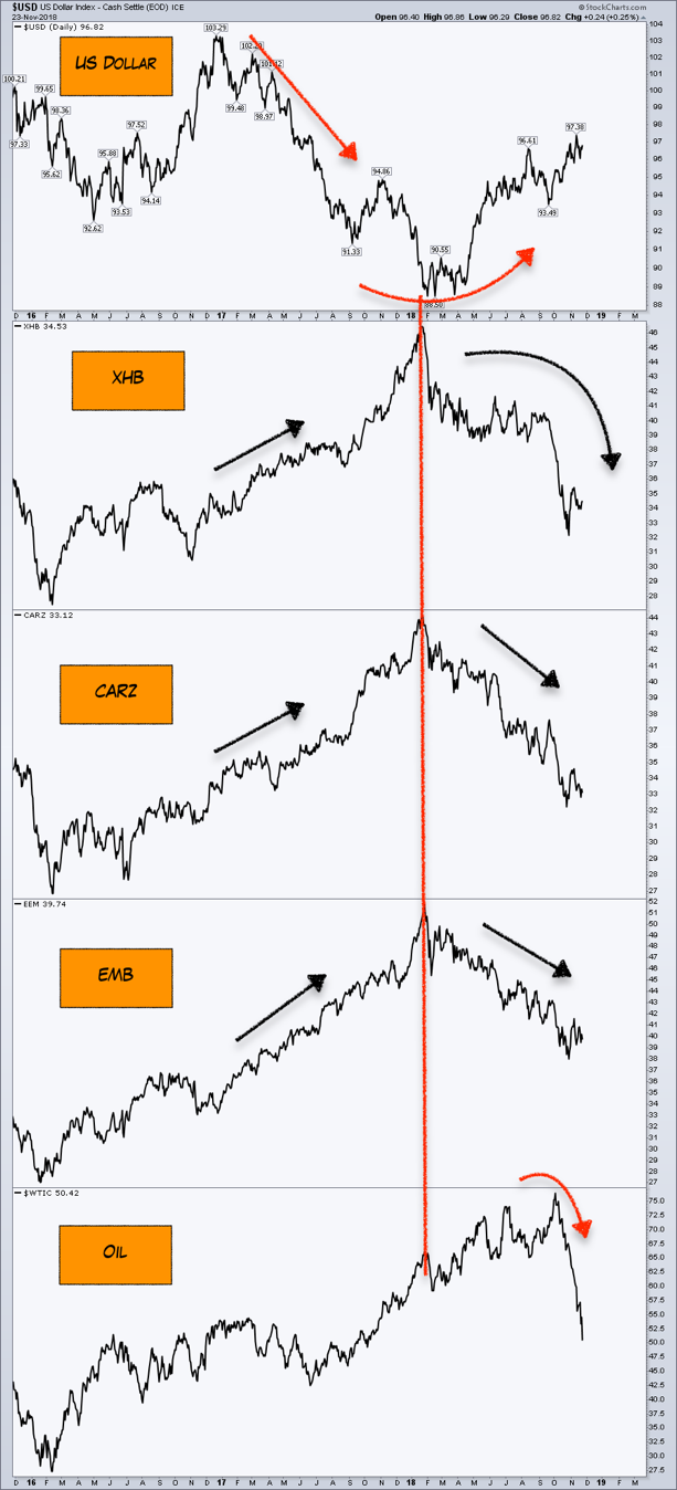
A further zoom-in to the two-year daily chart on the dollar's most recent rally shows just how inversely correlated it has been to economically-sensitive sectors and asset classes.
Cyclical vs. Secular
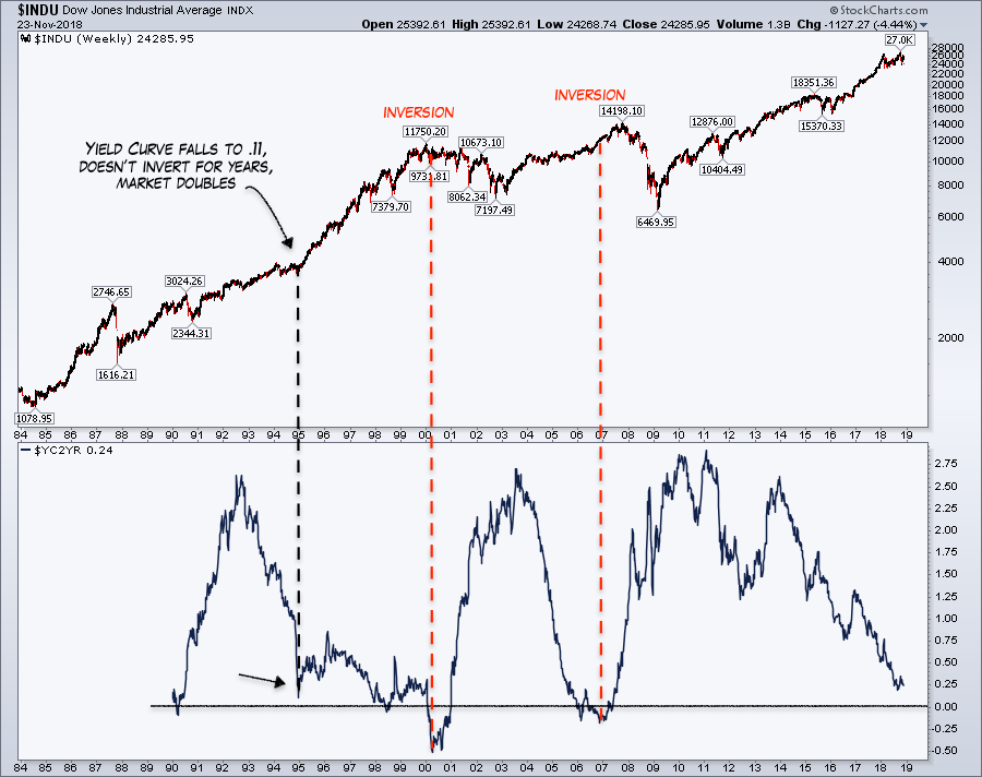
With the above charts and concepts not looking great, I wanted to close with two food for thought charts on long-term equity markets. First is the standard yield curve chart. Although the curve is flattening, it should be kept in mind we are still positive. Although '95 is a one-off example, it is instructive in that a flattening curve does not need to invert.
And lastly, here is a thought from a week or so ago. This ultimately is the game we are currently playing. The only thing we can do as market participants is keep an eye across liquidity, price action, valuations, intra-market and sentiment to get a sense of what is likely to come next. 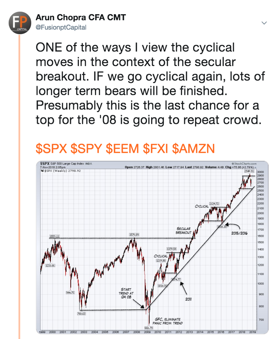
Thanks for reading...