The VIX Hits 9, So What?
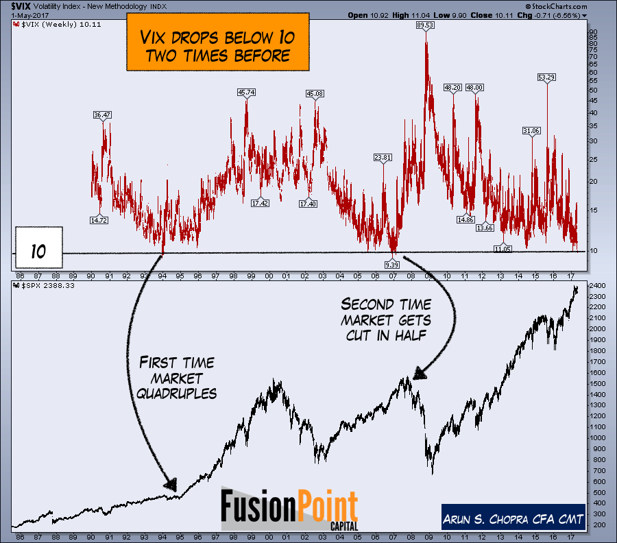
- The VIX traded below 10 this week.
- Many have used this as evidence of an impending top.
- Historical data shows two past examples, with entirely different outcomes.
With the Vix hitting 9 there's been a lot of charts showing this reduced level of activity, most centering around the idea of this being a massively bearish event. While there is no debate that low volatility readings indicate a reduced level of fear and complacent behavior, this needs to be put in context. I have already written a few articles here focusing on what I will be watching in this overall bull market to help guide any longer term topping process. Today's piece is simply to put this weeks '9' reading in context. Breaking a round figure like 10 sounds great, but lets look back at the last two instances. You can see below it's entirely inconclusive.
Chart 1: SPX with VIX 1986-2017
But let's take a look under the hood of each to see if we can get any further info (spoiler alert, not much-but still interesting). Below, the '93 market saw the VIX dump to under 10, which did lead to a 10% correction early the following year. Some of the additional indicators underneath include the federal funds rate and the yield curve. In theory this gives some sense of where in the cycle we were at the time. Below you can see the Fed was starting a rate hike cycle (bullish when it's due to real growth), while the curve was declining. For now see the hold at the 440 level on the SPX as volatility spiked to 23 in 1994.
Chart 2: SPX with VIX 1992-1995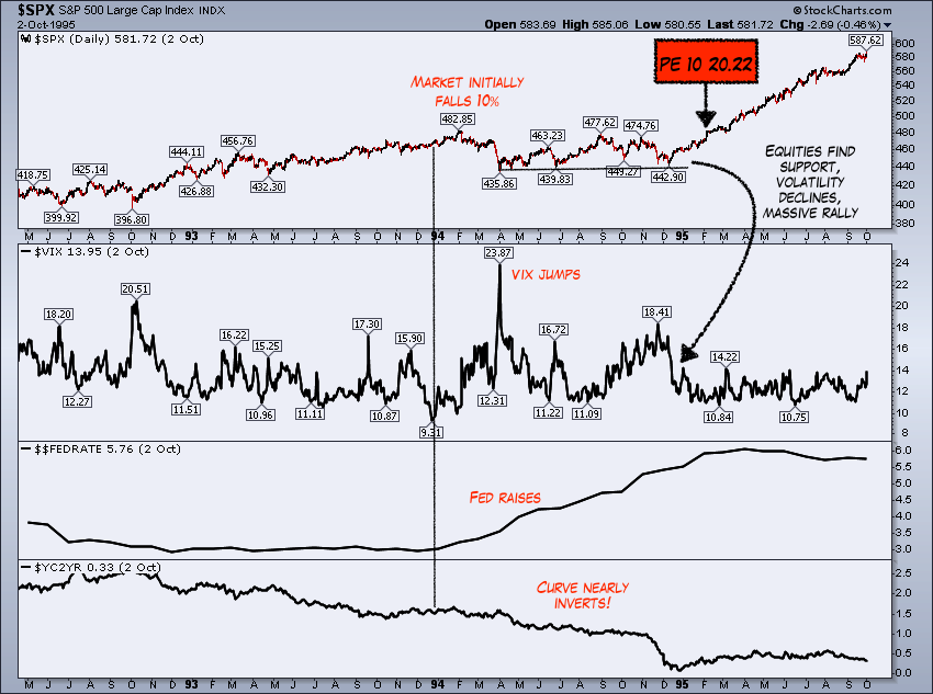
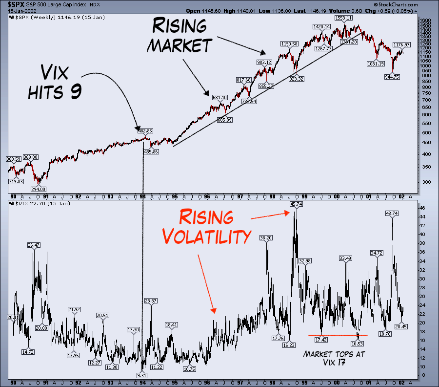
A larger step back from this point shows one thing that is important, that a rising volatility environment accompanied a rising market which is counter to what a lot would forecast today. Below shows the entire cycle.
Chart 3: SPX with VIX 1995-2000
Lets move to the 2007 experience, one that almost everyone is naturally most worried about. A few takeaways. One, the VIX dumped below 10 prior to another short term pullback (6%). The entire then market topped a year later. Conditionally speaking one difference here is the front end of the curve was already at 5% meaning the entire curve was inverted. In some respect a highly complacent market with those conditions in place that then prints a 9 on volatility is a big big warning. We aren't there yet in todays market but it clearly seems like it could occur. The bigger issue analytically speaking is we only have two prior examples to compare, but broadly speaking the conditions were significantly different from 1995. Economically and behaviorally this makes sense as being a warning.
Chart 4: SPX with VIX 2005-2007
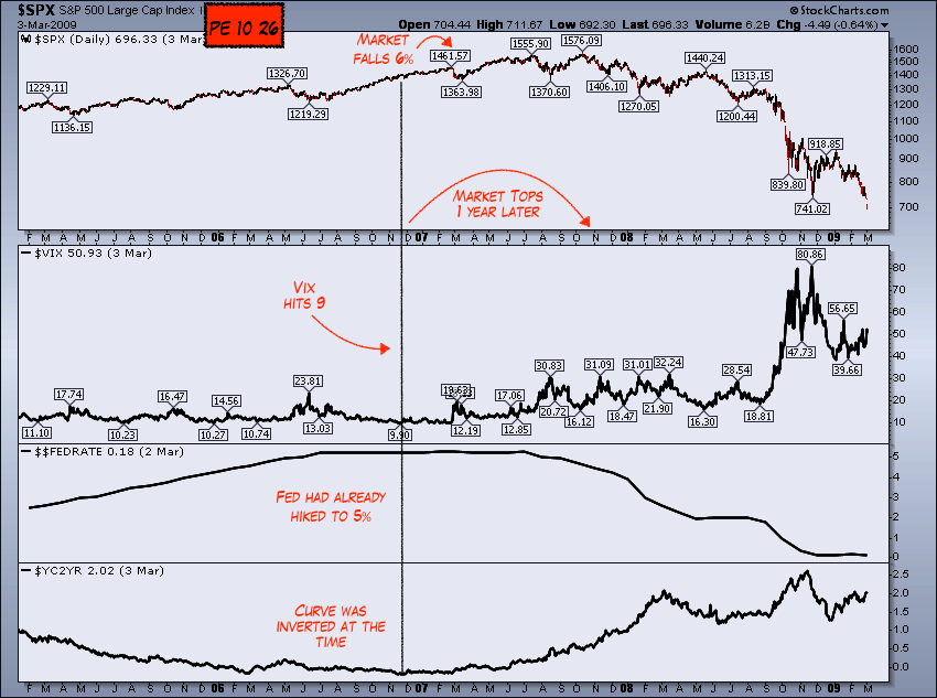
The final chart is just a step back from the zoom in to just show in 2007 how we saw markets eventually roll over with the VIX rising. In this case we saw the exact opposite scenario on the longer frames, that is declining markets and rising volatility.
Chart 4: SXP and VIX 2006-2009

With the VIX having printed a 9, and without question a complacent environment (as evidenced by numerous indicators), it's important to step back from the noise and see the bigger picture. One thing we can and should be aware of is both instances there were pullbacks in the shorter 3-6 month time frame. Other than that our experience is limited with the VIX as a longer term indicator which is why investors and more active participants need to use a more comprehensive approach than the latest headline event.
Thanks for reading....