Intel: The 15-Plus Year Breakout - Part 2

April 2018
- Price has zoomed 22% since the original article.
- A look at why.
- A deeper conversation into longer term price action.
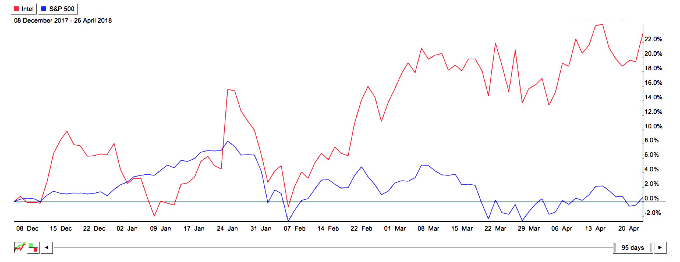
Since I wrote Intel, the 15+ Year Breakout, on December 6th, the stock has zoomed, up over 22% vs. the market which has essentially gone nowhere. In fact Intel (NASDAQ:INTC) has been the second-best performing mega cap since that time, only bested by Amazon (AMZN).
The article initially was supposed to be about my latest "fundamental factor" strategy, "earnings yield" stocks, which is one of eight factor models I run.
The Intel analysis was rooted in two more simple 20-30K foot concepts surrounding this most recent model, and I chose it because it was one of the bigger names out of my list. The hope was it would provide a good template for the strategy I was so excited about.
Basically this was the premise at the time:
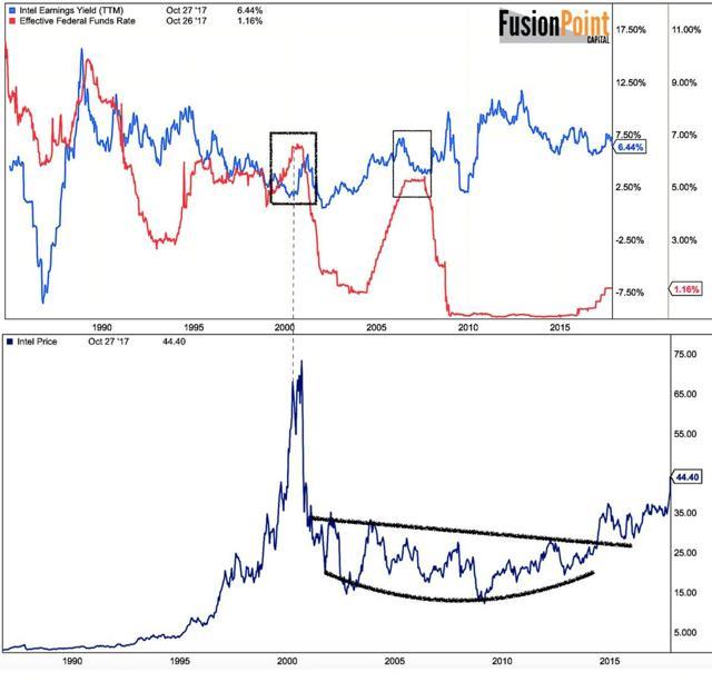
- Earnings yield model (upper panel) shows a name with significant outperformance potential, in this case Intel.
- The long term chart (lower panel) shows price was breaking out of a major base (multi decade).
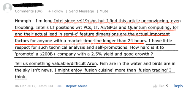
Some seemed to get it, others did not. I wanted to first address a comment which did not, because it brings up common misconceptions within my approach and price analysis in general. I've been meaning to address of few of the issues here, I just haven't had time.
First the comment. There are two main assumptions worth discussing.
- Company products - No discussion of what the company actually does (note this is "troubling" to the individual).
- Using a chart apparently means one has a short-term (even 24 hour) time frame.
Anyone who follows my work knows I don't apologize for incorporating price into my approach. I do however try my best to correct the more basic criticisms, as it is one of the most mal-practiced schools of study on the internet.
Price as an Indicator
Pure price analysts (which I am not) believe that price incorporates all the information one needs to know. If the fundamentals are good, or the business is improving, then the price chart should reflect that. Deeper analysis can include things like volume and relative strength (more later). While I can understand the concern of not mentioning a company's products, those who understand the above view, they will realize it goes without saying.
For anyone more detailed, they also will understand the chart was secondary to the fundamental earnings model itself. The yield was tremendous at the time because of those very products. It would not have made my strategy list in the first place if that wasn't the case (although there's an argument about earnings durability/quality that, yes, takes some homework). Those two factors alone (model plus long-term base) are very powerful.
The first comment however is so wildly off (with respect to "24 hour" time frames) it makes sense to correct it. I can understand the confusion given the short-term nature of traders (who generally only use charts) and the overall bad charts that are all over the web. That said, the idea that because there's a chart in the analysis, we are being short term in thought is a disservice to anyone looking for more reliability in their public market investment approach.
I found a more studied question here,
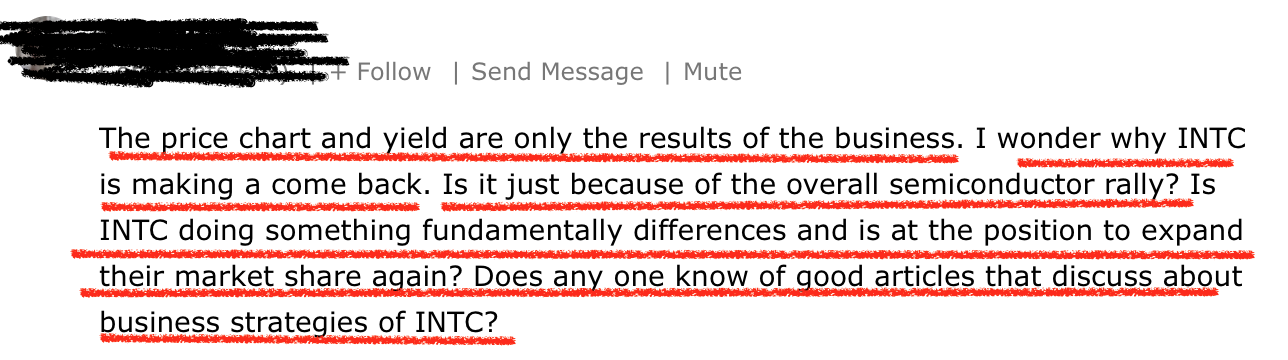
A solid takeaway. The question essentially is "why is price doing this?"
Intel is a great example because the driver of the stock has been the business shift away from PCs and towards a data company. 50% of revenue in the last quarter (Q1 '17) came from the DCG (Data-Centric Group) unit. It was Intel's biggest quarter in the 50-year history of the company, blew out expectations, raised '18 topline estimates to 67.5B (approx 7% yr/yr) and upped January's capex estimates by 500M (acceleration in cloud primarily). But how does the long-term chart help in this analysis?
Let's take a step back and look at that technical price base from the first article and try to marry it with the second comment.
The multi decade price move isn't about a "trade," it's about the new lines of business, the growth of those businesses, the margins associated with them, the TAM, and the sentiment on the stock, all in the context of both its current valuation and longer-term stock strategy. This is how you combine factors.
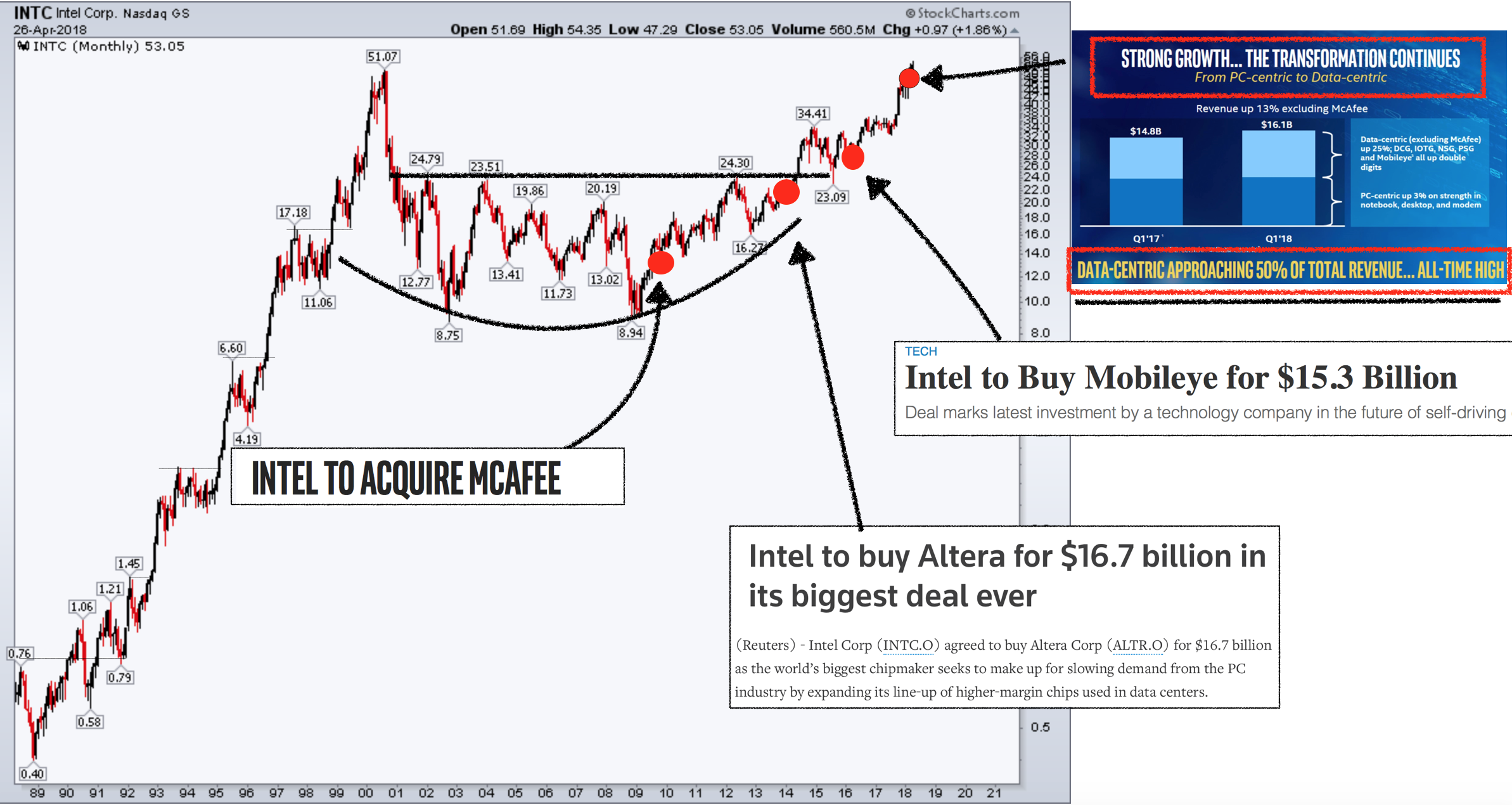
The price component is critical because it refers to the "when." You can have all the DCFs (incorporating the new businesses), ratios, and valuation metrics you want, but if the market price isn't reacting something is wrong. Further, any model will be littered with assumptions, whereas price shows us what the market is actually doing.
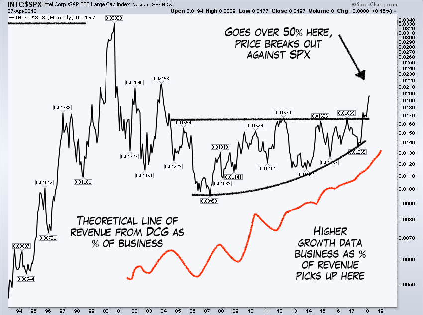
For the brainy, I bet if you took a chart of the percent of Intel's business related to DCG (Data Centric Group), and overlaid it on the relative strength of Intel (Intel vs. the broad market) you would find a correlation. Here's what that theoretically would look like (I don't have the exact data, just experience to know how markets price).
But let's look at some other long-term fundamental relationships I knew about at the time. Again, 20-30K feet thoughts, not 24-hour trades or deep product reviews.
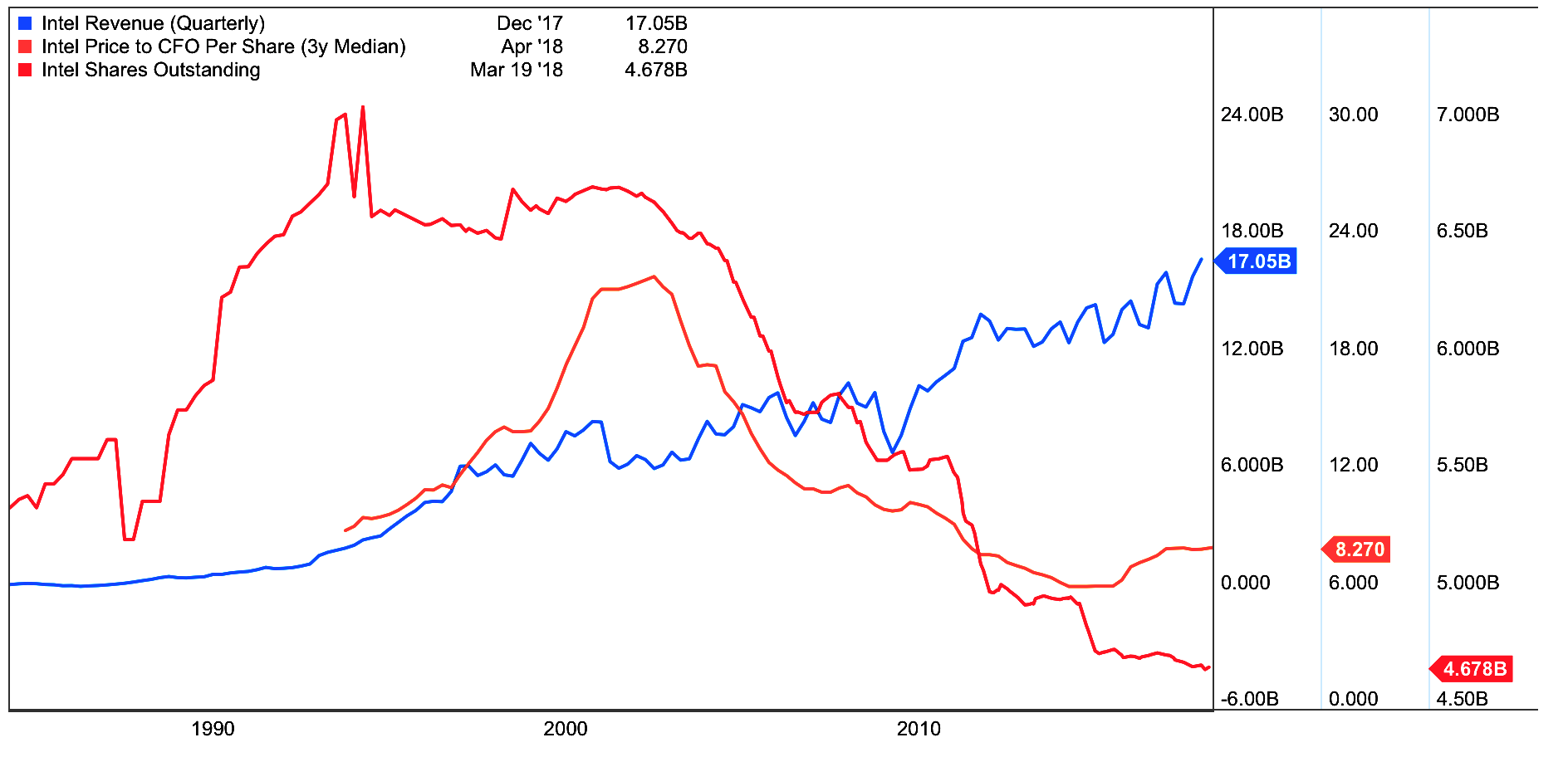
1. Shares Outstanding vs. Price vs. Multiple
The below shows the incredible multi-decade reduction in Intel's O/S (outstanding shares) in the last 20-plus years. This was done primarily out of CFO capex dividends, meaning a real return. It is a form of owner's profits. This is a long-term driver that set the stage for the giant price base to actually work (right when many were throwing in the towel). The key takeaway is there are ways to improve the reliability a chart if you understand finance, markets, and how equity works. That is the core of what I do.
Further we see the revenue (blue line) rising with the multiple (orange line) turn up. That tells us for the first time in some time that the market was starting to pay up for those sales (read exiting bear market for valuation). Intel fundamentally had been exiting the dumps for some time.
Factors Change
Intel actually is officially off my earnings yield strategy (opportunity to profit from that factor is gone) but Intel has now entered my "Four Star" list, a more preferred place longer term (more quality and growth factor model). I expect it to stay there given what I know about the operations, and how the company is executing.
There are some great conversations to be had about what it's worth, how to price it going forward and so forth, but really what is exciting is watching a stock 20 years later break out for all the right reasons.
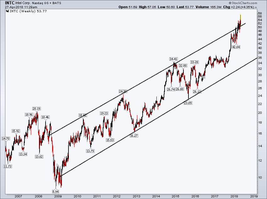
Some had asked about what I would do with the stock. I don't give specific advice on a one-off public article, but the intermediate (10-year) chart below is certainly extended and in the upper end of the trend. I'm personally not interested in making new commitments to the name anytime soon, even in the face of such a blowout quarter (for the counterintuitive this should make sense independent of the chart).
I do have a variety of price targets on the name based on the above and more, but I like to manage the pathway as well.
Earnings Yield Strategy
Last some comments on the strategy which found the stock in the first place.
One of the reasons I like factor investing is it moves away from name specific, or trendy type things, into profiting from specific "fundamental factors." The more "difficult stuff" at the time were two member stocks I recommended. One was American Healthcare (NYSE:AMN) and the other was Ply Gem (NYSE:PGEM). Both of these hit my Earnings Yield strategy list (about 40 names, narrowed to 2-4 selections). Even though they both have different products, as stocks they offered very similar investment opportunities, especially when screened for quality.
PGEM
At the time of the recommendation on PGEM, the stock was trading around 12 bucks a share. Plygem was in the housing space, making very nice remodeling materials and products.
PGEM was quickly bought out at 22, a 20% premium strongly validating my earnings model strategy.

AMN Healthcare Services (AMN)
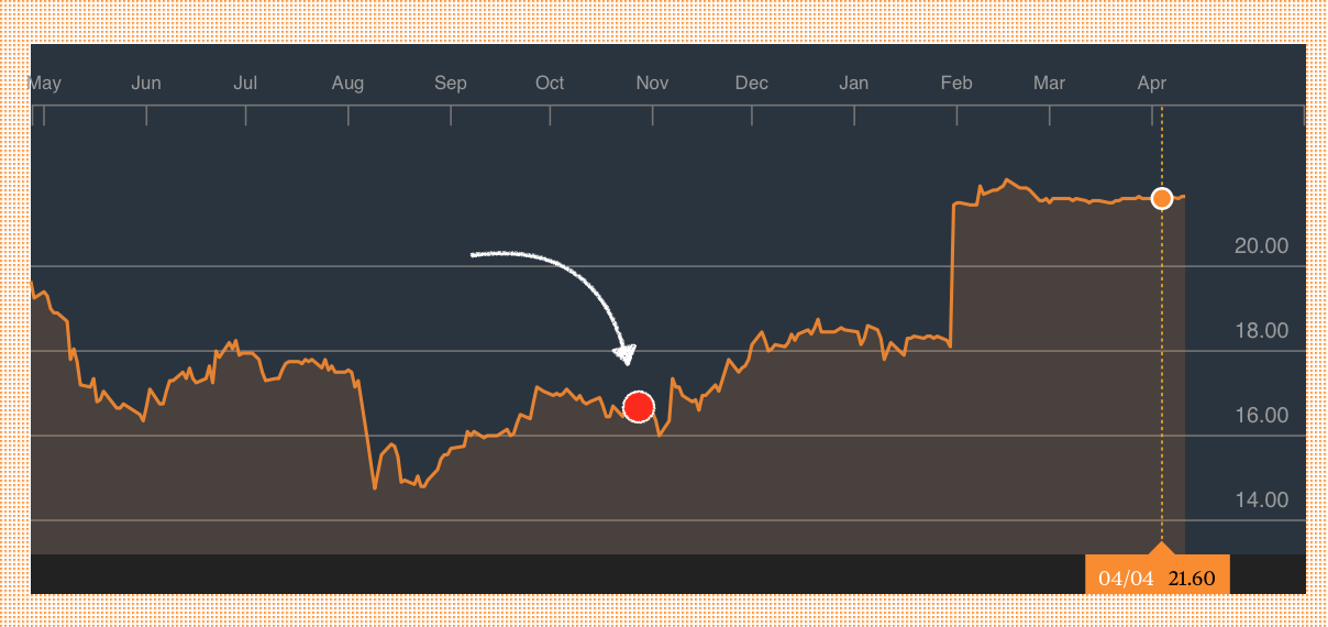
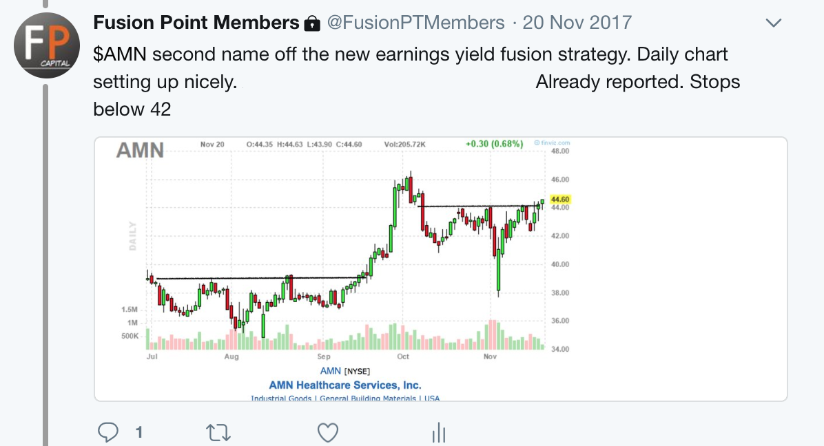
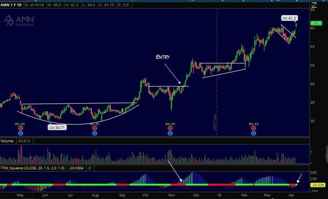
AMN's real time recommendation was at $44 a share. This was an even better move. Again keep in mind the chart is simply the entry, the stock was bought for the same fundamental criteria Intel and Ply Gem were.
AMN Healthcare Services ended up running to $61-plus and of last check was above $68.
Hopefully the above was a helpful look at how a fundamental model coupled with reasonable price action (and time frames) can find us quality names to trade and invest in.
Thanks for reading.